Branding
Branding (the Branding category of the Settings menu) controls the visual identity and interface appearance of the DeskAlerts web portal.
Use this section to configure:
- application name and logo
- light/dark/system theme
- interface language
- animated backgrounds
- custom fonts
- design tokens (advanced): brand and entity colours, typography, shape, motion
Application name and logo
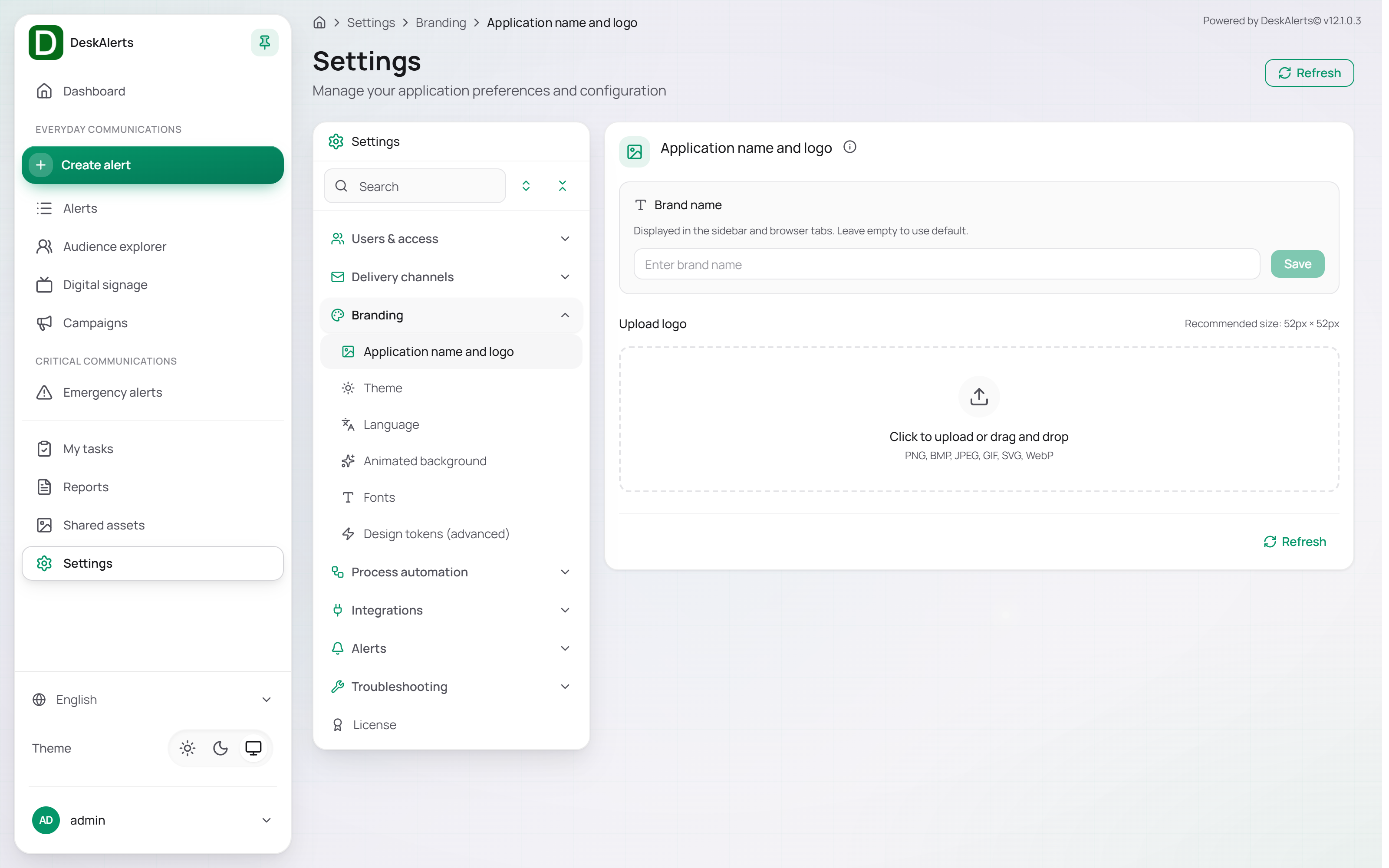
Application name and logo controls the product name and logo displayed in the web portal.
 Application name and logo
Brand name
The Brand name appears in the sidebar and browser tabs. Leave the field empty to use the default name (DeskAlerts). Click Save to apply it.
Upload logo
Upload a custom logo by clicking the upload area or dragging a file into it.
Supported formats:
- PNG
- BMP
- JPEG
- GIF
- SVG
- WebP
Recommended size: 52 × 52 px.
Theme
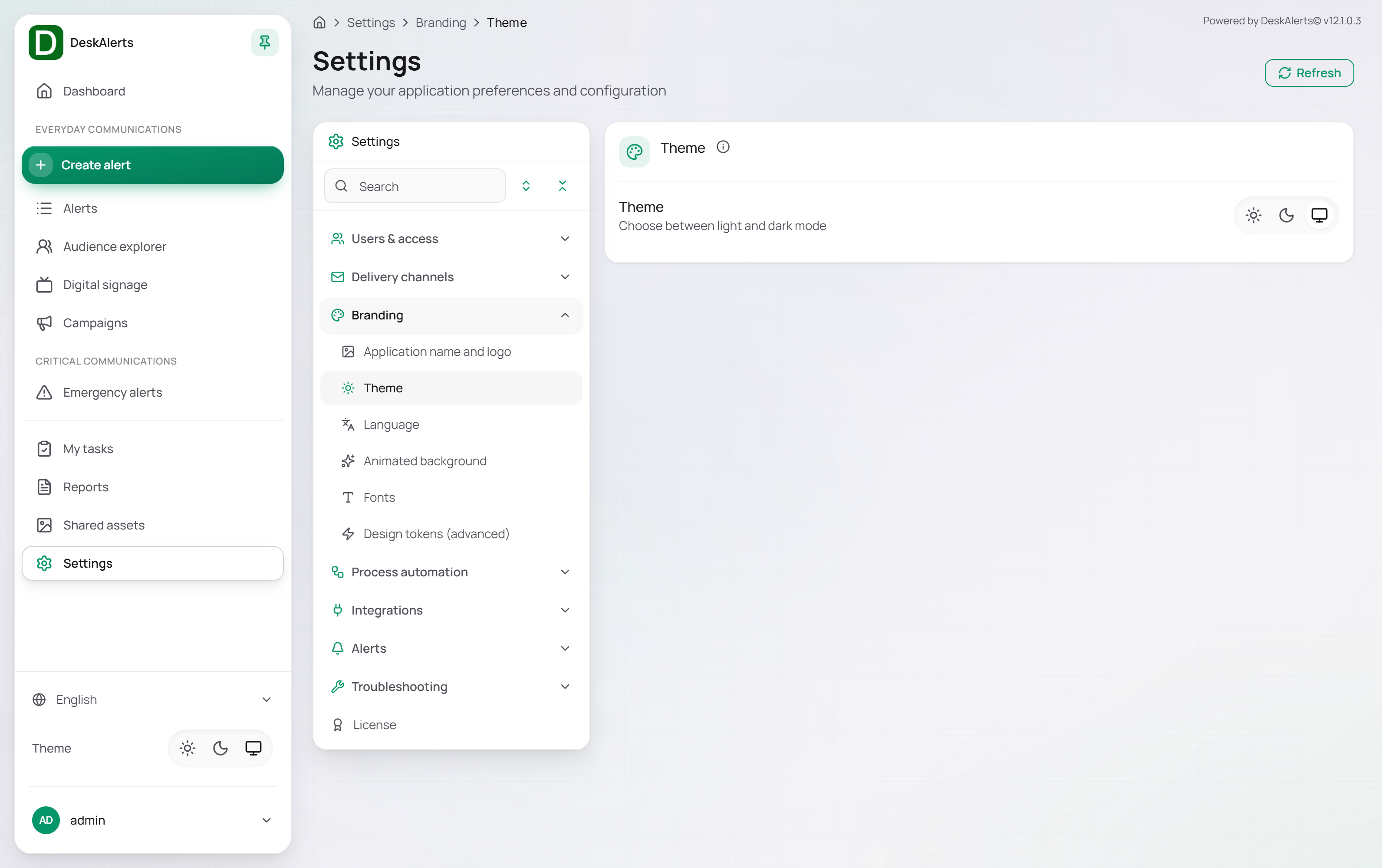
Theme controls the portal color mode. The page contains a single Theme switch with three icon buttons.
 Theme
| Option | Description |
|---|---|
| Light (sun icon) | Uses the light interface theme |
| Dark (moon icon) | Uses the dark interface theme |
| System (monitor icon) | Follows the operating system preference |
The same switch is available at the bottom of the left navigation panel on every page of the web portal.
Language
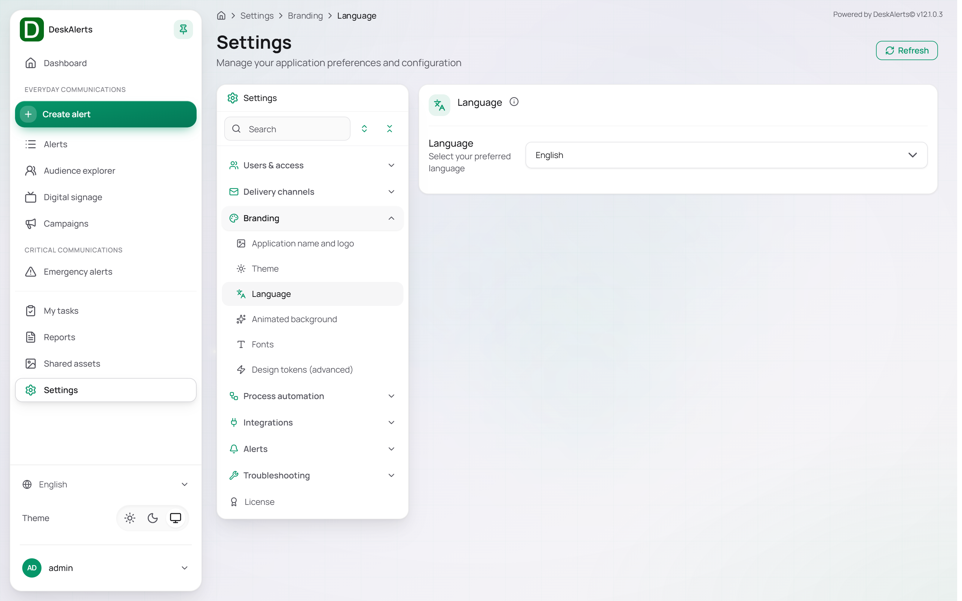
Language settings define the web-portal display language.
 Language
Select a language from the Language dropdown to update the interface language; the change applies immediately. The dropdown lists the interface translations installed on the server — English plus the additional languages such as Français, Español, Português, Deutsch, and العربية. The same selector is available at the bottom of the left navigation panel.
Animated background
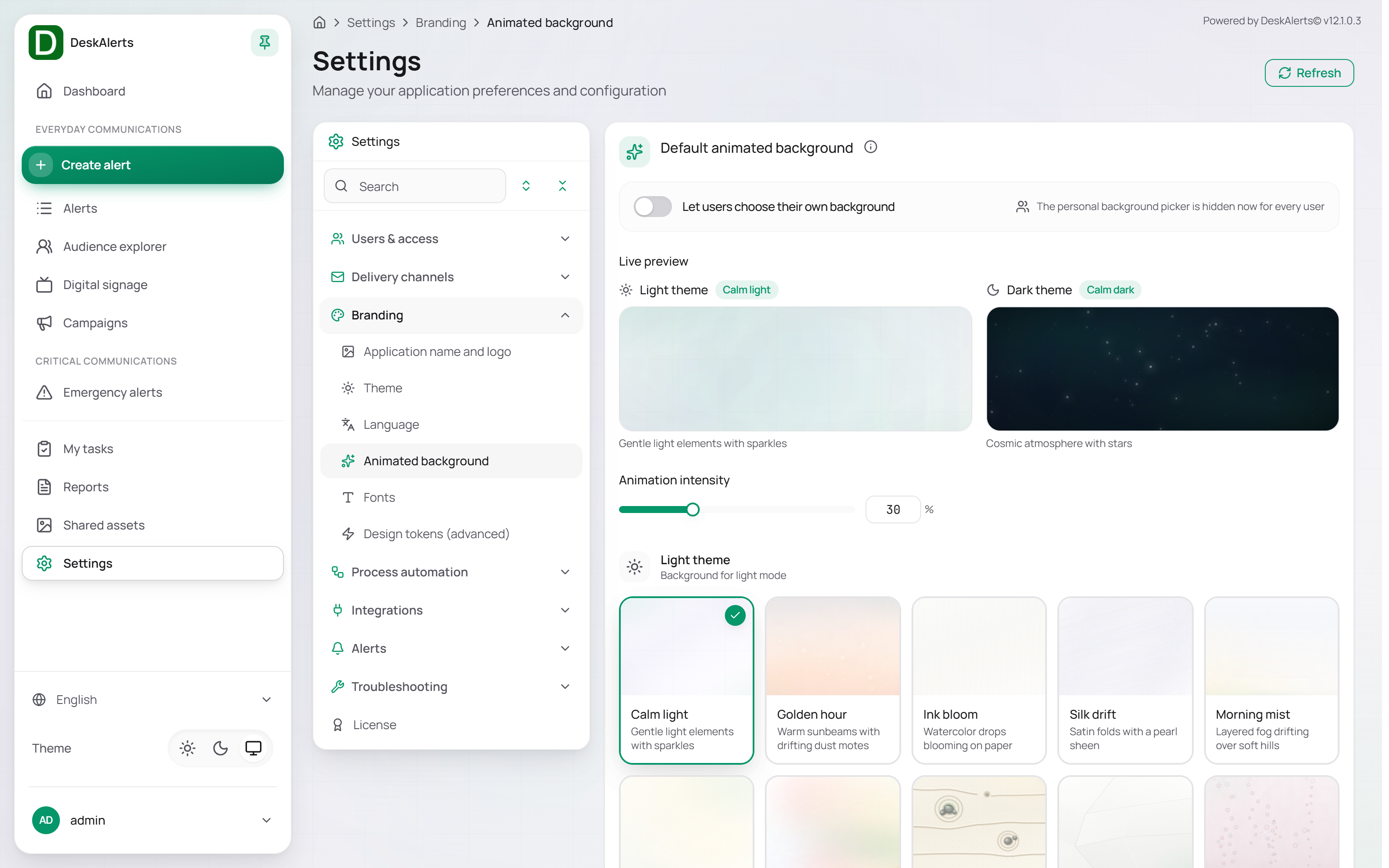
Animated background controls the decorative animated background behind the web-portal pages.
 Animated background
| Setting | Description |
|---|---|
| Default animated background | The background every user gets — one for the light theme, one for the dark theme |
| Let users choose their own background | When on, each user can pick a personal background; when off, the personal background picker is hidden for every user |
| Live preview | Shows the backgrounds selected for the light and the dark theme before applying them |
| Animation intensity | Controls animation strength, in percent |
Backgrounds are configured separately for the Light theme and the Dark theme. Each gallery card shows the name and a short description of the effect.
| Theme | Backgrounds |
|---|---|
| Light theme | Calm light, Golden hour, Ink bloom, Silk drift, Morning mist, Komorebi, Prism light, Zen garden, Paper relief, Champagne, Gilded marble, Daydream clouds, Opal shimmer |
| Dark theme | Calm dark, Midnight rain, Abyssal glow, Ember glow, Aurora veil, Obsidian gold, Distant storm, Fireflies, Neon horizon, City pulse, Ferrofluid, Star atlas, Moonlit tide |
Click Save to apply the selection.
Fonts
Fonts lets administrators upload and manage the fonts used in the web portal, in the design tokens, and in alert skins.
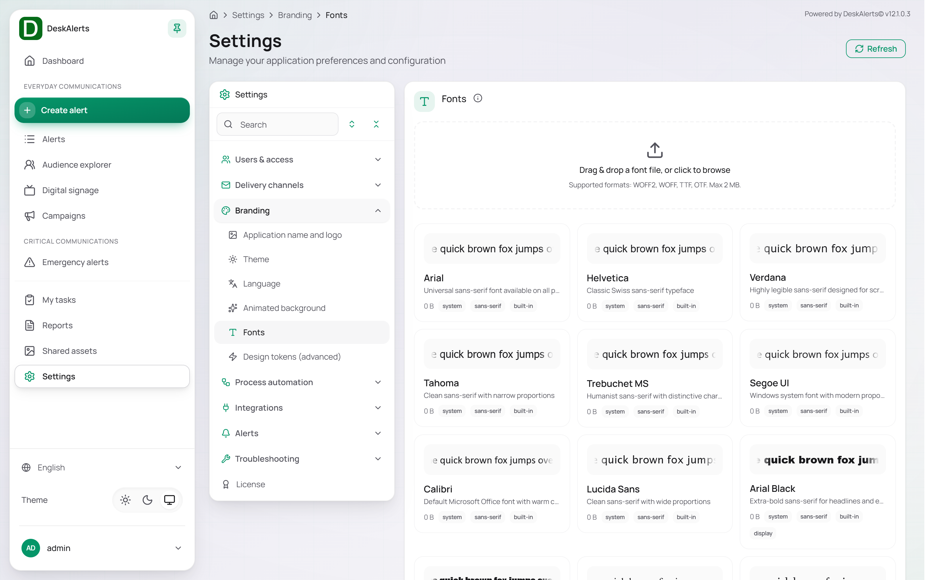 Fonts
Drag a font file onto the upload area, or click it to browse.
Supported upload formats:
- WOFF2
- WOFF
- TTF
- OTF
Maximum file size: 2 MB.
Each font card displays a preview, name, file size, and tags such as system, sans-serif, serif, monospace, display, handwriting, variable, or built-in. The list starts with the system fonts (Arial, Helvetica, Verdana, Segoe UI, Times New Roman, Courier New, and so on) and continues with the web fonts shipped with the portal — Manrope (the DeskAlerts default), Plus Jakarta Sans, IBM Plex Sans, Source Sans 3, Nunito Sans, and others.
Built-in fonts cannot be removed. Uploaded fonts can be deleted.
Design tokens (advanced)
Design tokens (the Design tokens (advanced) page) give you control over the design system of the DeskAlerts web portal: the brand colours, the colours that mark alert types, audience kinds and delivery channels, typography, shape, and motion — all applied globally across the interface.
Warning: Design tokens are an advanced feature intended for administrators who are familiar with design systems. Incorrect values can affect visual consistency and usability for every user across the entire interface. Test your changes in a non-production environment before applying them.
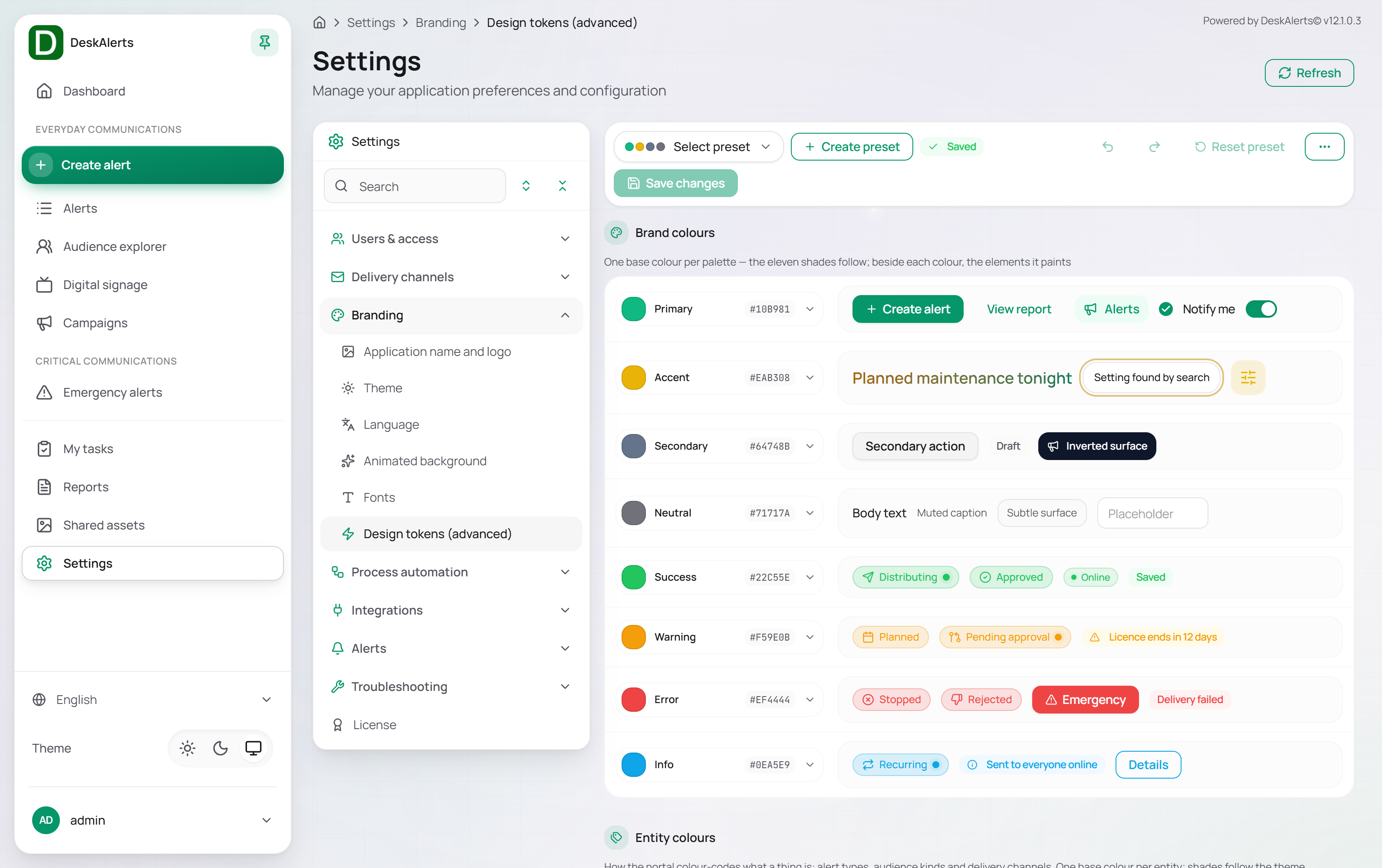 The Design tokens page — presets and Brand colours
Presets
The toolbar at the top holds Select preset, Create preset, Reset preset, and Save changes; a Saved badge shows that the current values are stored. A preset is a named set of all token values: create one before experimenting, so that the stored look can be restored with one click.
Brand colours
One base colour per palette — the eleven shades of each palette follow from it. Beside each colour the page shows the interface elements it paints:
| Palette | Default | Paints, for example |
|---|---|---|
| Primary | #10B981 | Primary buttons such as View report and Notify me |
| Accent | #EAB308 | Highlights such as a setting found by search |
| Secondary | #64748B | Secondary actions, the Draft state, inverted surfaces |
| Neutral | #71717A | Body text, muted captions, subtle surfaces |
| Success | #22C55E | Distributing, Approved, Online, Saved |
| Warning | #F59E0B | Planned, Pending approval, licence reminders |
| Error | #EF4444 | Stopped, Rejected, Emergency, Delivery failed |
| Info | #0EA5E9 | Recurring, delivery details |
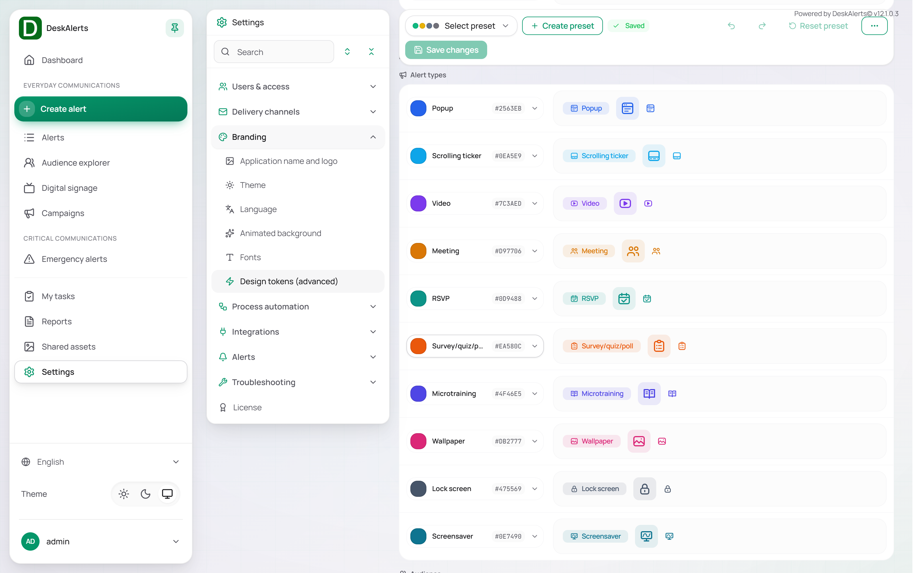 Entity colours — alert types, audience kinds, delivery channels
Entity colours
How the portal colour-codes what a thing is. One base colour per entity; the shades follow the theme.
| Group | Entities |
|---|---|
| Alert types | Popup, Scrolling ticker, Video, Meeting, RSVP, Survey/quiz/poll, Microtraining, Wallpaper, Lock screen, Screensaver |
| Audience | Users, Groups, Organizational units, Computers, IP groups, Bundles |
| Delivery channels | Desktop, Mobile, Email, SMS, MS Teams, Text-to-call |
| AI material | The palette of the AI surfaces — the assistant, AI actions and the guide rail |
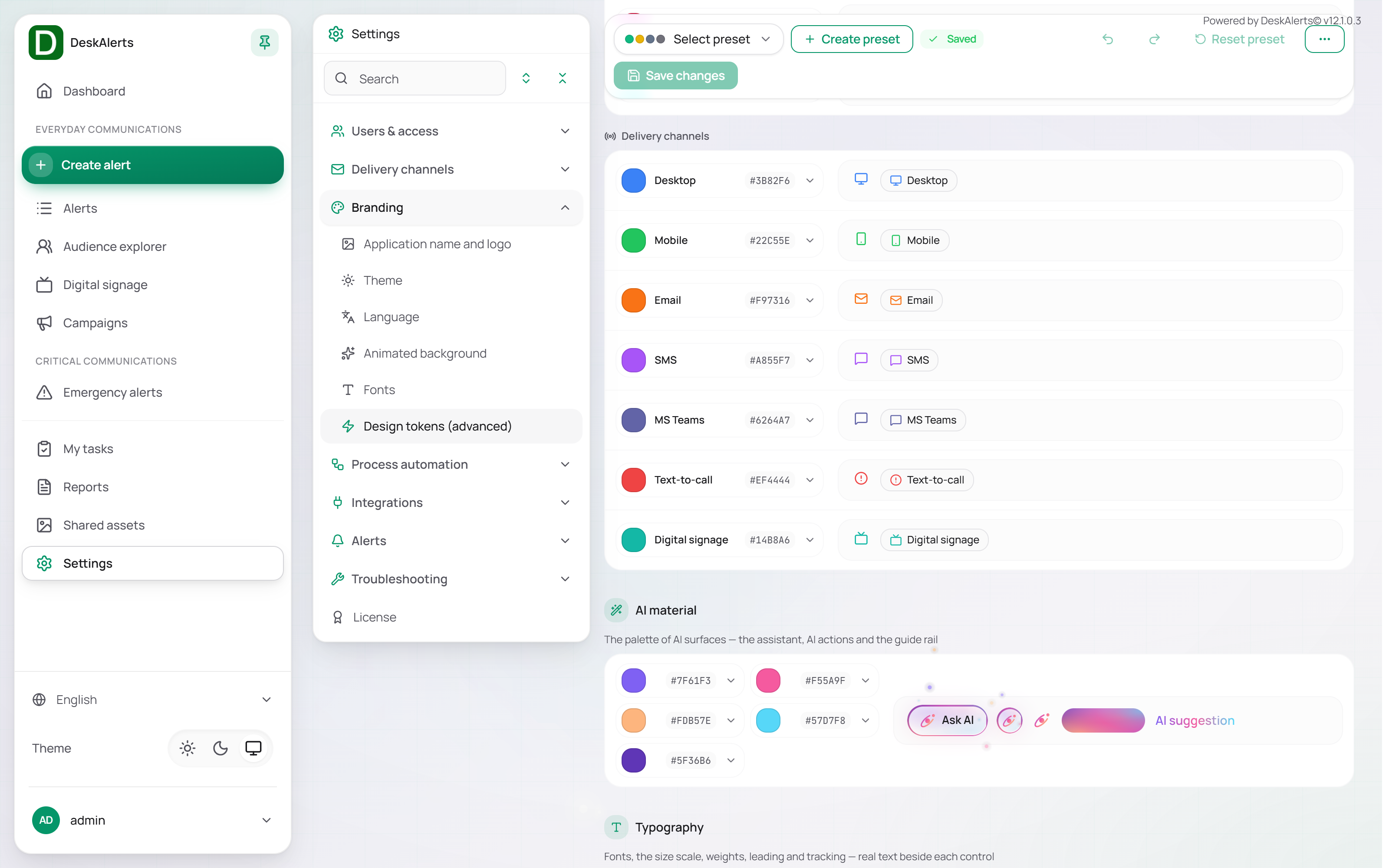 Typography, Shape and Motion
Typography
| Setting | Description |
|---|---|
| Body | The default UI and body font (Manrope by default); the list offers the fonts of the Fonts page |
| Monospace | The font for code and technical text (JetBrains Mono by default) |
| Base size | Body text size in rem (usually 1rem = 16 px) |
| Body weight / Emphasis weight | The default weight for paragraphs and UI, and the weight of titles, labels, selected items and buttons |
| Base line height | Drives all line-height tokens from one base value |
| Base tracking | Overall letter spacing in em; the extremes are derived from this value |
Real text is rendered beside each control, so the effect of a change is visible before it is saved.
Shape
Base radius — one base radius (in rem) drives the corners of buttons, inputs, cards, modals and tooltips; the preview shows buttons, a card and a status chip with the current value.
Motion
Animations enabled — when off, every transition and animation renders at its final state for all users; shadows and glass effects stay. The preview shows the pulse of live statuses such as Distributing and Recurring.
Click Save changes to apply the values to every user, or Reset preset to return to the stored preset.