Alert Appearance
Overview
The Alerts group of Settings controls how alerts look and behave for recipients: the visual skins of popup and ticker alerts, the defaults applied to every new popup and ticker, the activation of emergency alerts, and the Azure AD application used by Meeting alerts.
Navigation
The Alerts group of the Settings menu contains:
- Popup and ticker skins — visual templates for popup and ticker alerts
- New popup and ticker defaults — defaults applied to newly created popup and ticker alerts
- Emergency alerts → Activation — how emergency alerts are activated
- Meeting alert (MS Teams) — the Azure AD application for Meeting alerts, described in Delivery channels
Popup and ticker skins
Skins are the visual templates used for popup and ticker notifications delivered by the desktop agent.
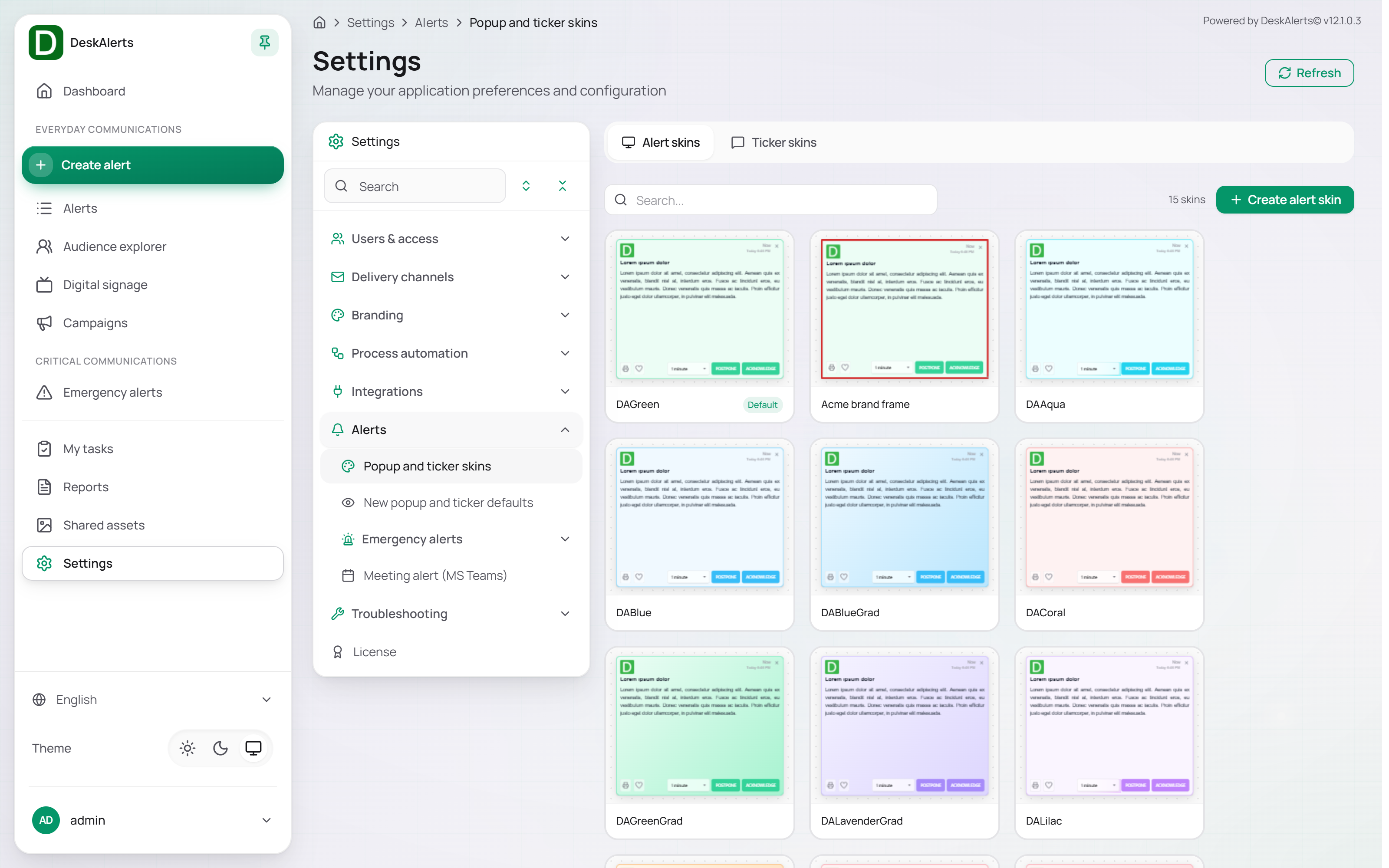 Popup and ticker skins — the Alert skins tab with the built-in skins
The page contains two tabs:
| Tab | Description |
|---|---|
| Alert skins | Visual templates for popup alerts, displayed as a grid of preview cards (15 built-in skins; DAGreen is the default) |
| Ticker skins | Visual templates for horizontal ticker notifications, displayed as a list of banner previews (14 built-in skins) |
A search field is available on both tabs to filter skins by name. The total skin count is shown above the list. The previews of the cards render a few seconds after the page opens.
Alert skins tab
Popup alert skins are displayed as a grid. Each card shows a live thumbnail preview of the skin, the skin name, and a Default badge if the skin is set as the system default.
Click Create alert skin to open the skin editor, or click a card to edit that skin.
Ticker skins tab
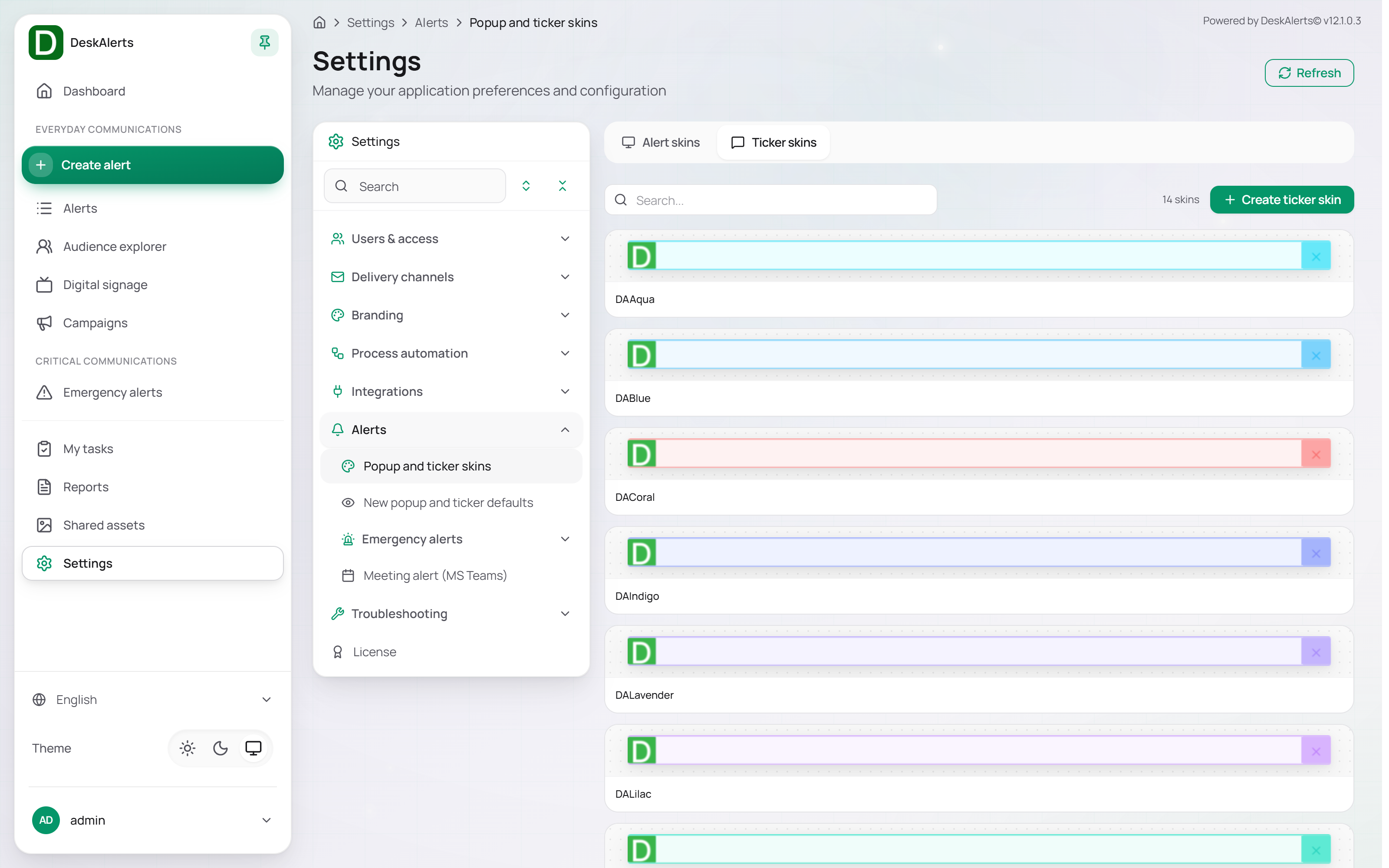 Ticker skins tab
Ticker skins are displayed as a list of horizontal banners, reflecting the proportions of a ticker notification. Each entry shows the skin preview and the skin name.
Click Create ticker skin to open the ticker skin editor.
Alert skin editor
Clicking Create alert skin opens the Create alert skin page; clicking an existing skin opens the same page as Edit alert skin.
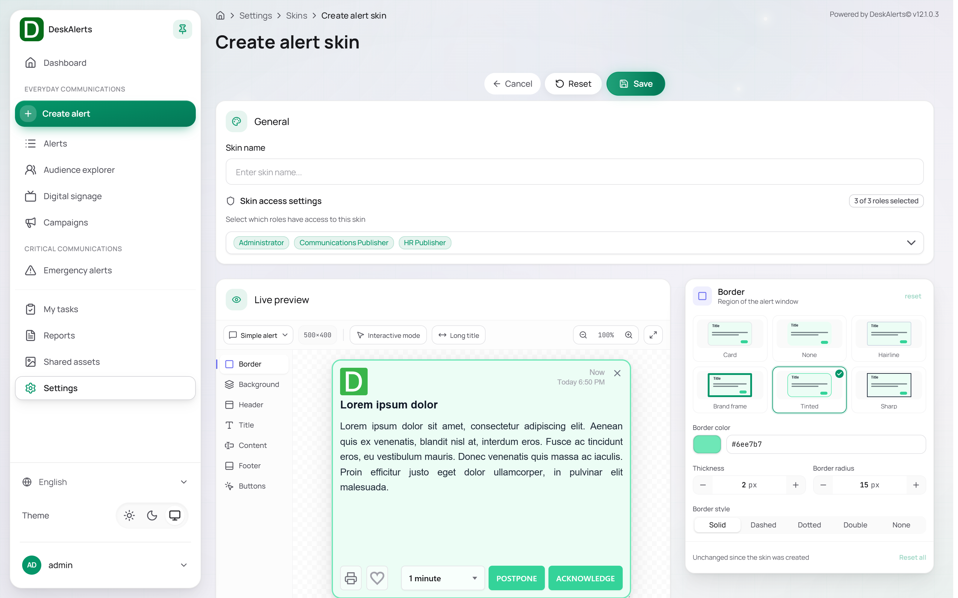 Alert skin editor — General, Skin access settings, Live preview and the region list
Three actions are available at the top of the page:
| Action | Description |
|---|---|
| Cancel | Discards changes and returns to the skins list |
| Reset | Reverts all unsaved changes to the last saved state |
| Save | Saves the skin |
General and skin access
| Field | Description |
|---|---|
| Skin name | The name publishers see when they pick the skin in the alert composer |
| Skin access settings | The web-portal roles that may use this skin, shown as chips with a counter (for example, 3 of 3 roles selected). Click a chip to grant or revoke access. A new skin is available to all roles |
Live preview
The Live preview area renders the alert in real time as edits are applied.
| Control | Description |
|---|---|
| Preview type | Switches the preview between the alert layouts the skin is used with (Simple alert by default) |
| Interactive mode | When enabled, lets you click elements directly on the preview to open their region |
| Long title | Shows the preview with a title too long for its row, to see what the title overflow choice does |
| Size and zoom | The preview size (for example 500×400) and the zoom level (100%) |
Regions
The region list on the right side of the editor holds the configurable regions of the alert window: Border, Background, Header, Title, Content, Footer, and Buttons. Click a region to expand its settings. Every region starts with a row of presets (click one to apply a ready combination) and has a reset link; Reset all at the bottom returns every region to the saved state, and a status line says whether the skin changed since it was saved.
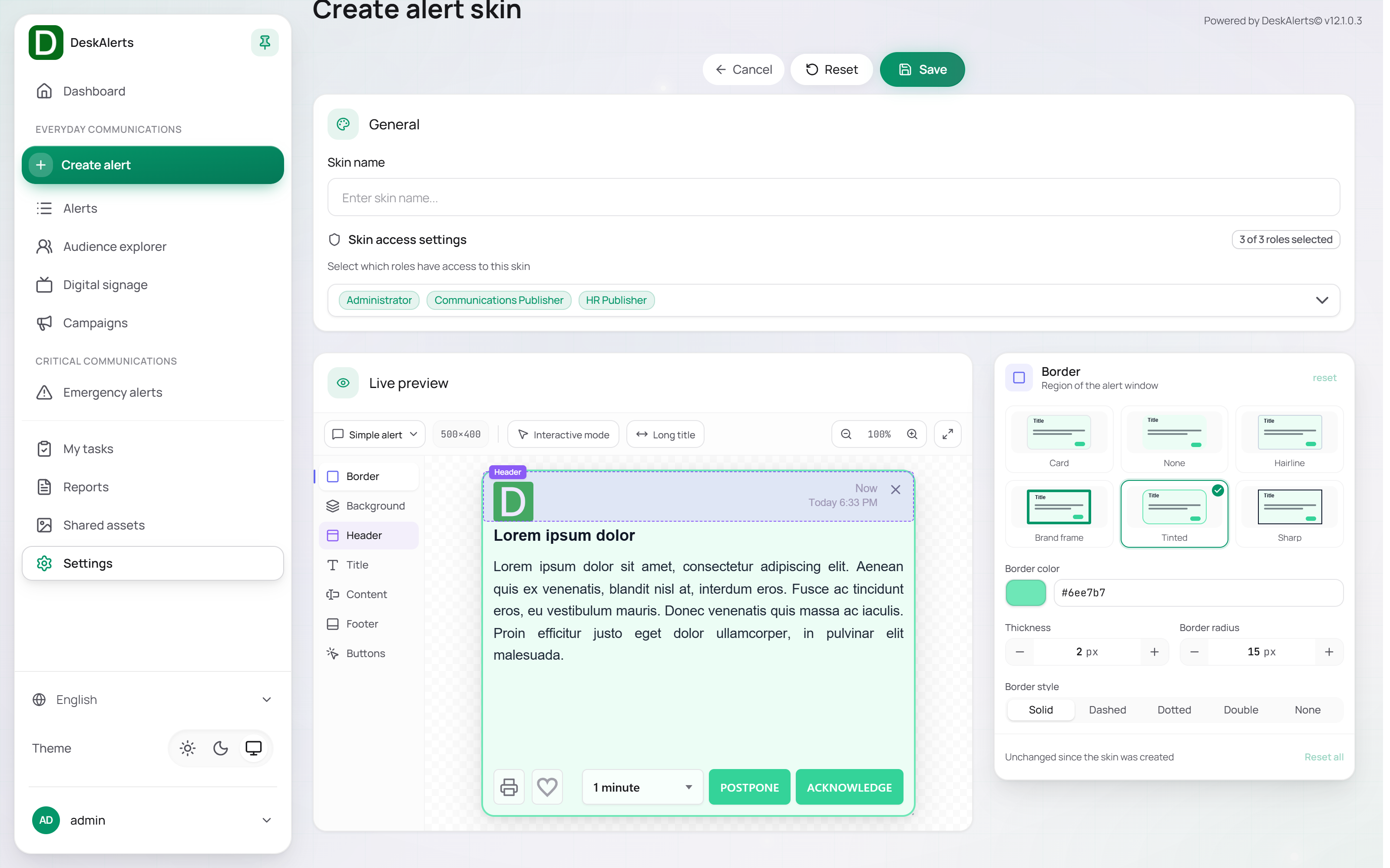 The Border region with its presets
| Region | Presets | Settings |
|---|---|---|
| Border | Card, None, Hairline, Brand frame, Tinted, Sharp | Border color, Thickness (px), Border radius (px), Border style (Solid, Dashed, Dotted, Double, None) |
| Background | Paper, Tinted, Subtle, Soft fade, Brand gradient, Dark | Color or Gradient, and the Fill color |
| Header | Plain, Subtle, Tinted, Accent, Brand bar, Ink bar | Show logo, Logo image (the current file with a Change button), Logo alignment, Show created date with Date language (Automatic follows the recipient's system language and region, including the 12- or 24-hour clock), Header background |
| Title | — | Font, size, weight, colour and alignment of the title, and what happens to a title too long for its row (use Long title in the preview to see it) |
| Content | — | Font, size, colour, padding and line height of the alert body |
| Footer | — | Whether the footer is shown, its text, font and colours |
| Buttons | Primary, Pill, Outline, Soft, Ink, Square | Button background, Button text, Button border, Border radius (px), Font size (px); Close button — Icon color and Icon size (px) |
Colors are set with a color swatch picker or by typing a hex value. The font lists include the system fonts and the fonts of Settings → Branding → Fonts.
A saved skin is offered under Appearance → Alert skin in the alert composer and is applied by the desktop agent to the alerts created with it.
A skin for full-screen video
To show a video alert over the whole screen with nothing but the video, create a skin for it and select it together with Window type: Full screen in the alert (see Video alert): in Header switch off Show logo and Show created date, in Title hide the title, in Content set the padding to 0, in Border set Thickness and Border radius to 0, and in Background choose a solid black colour (#000000). The close button and the time stay in a thin strip at the top; the video fills the width of the screen, and the whole screen when its aspect ratio matches the monitor's.
Ticker skin editor
Clicking Create ticker skin opens the Create ticker skin page.
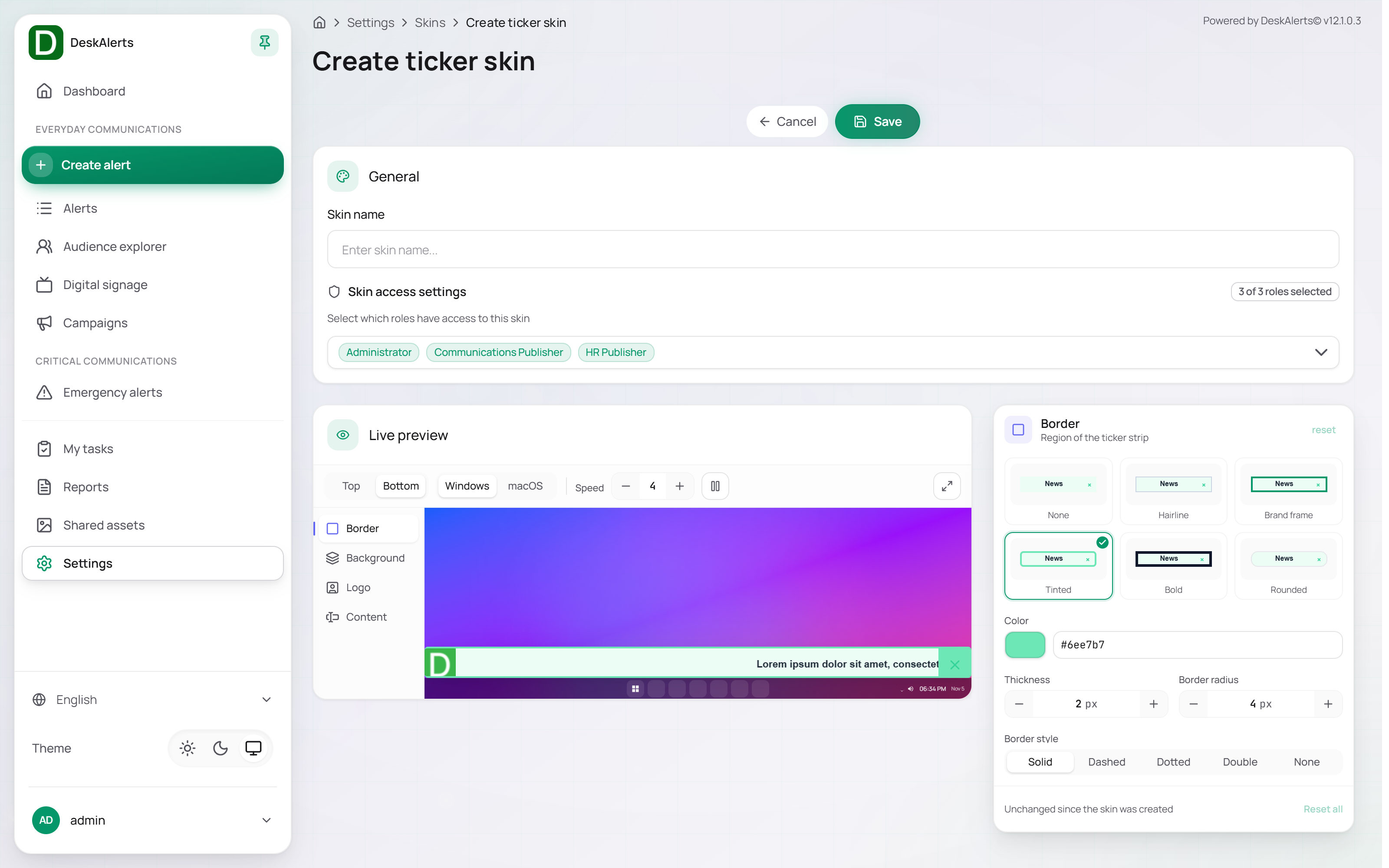 Ticker skin editor
The preview at the top shows the ticker strip as the agent draws it; switch it between Top and Bottom placement and between the Windows and macOS look, and set the Speed of the scrolling preview. The strip shows the current time and date on the right, as the real ticker does.
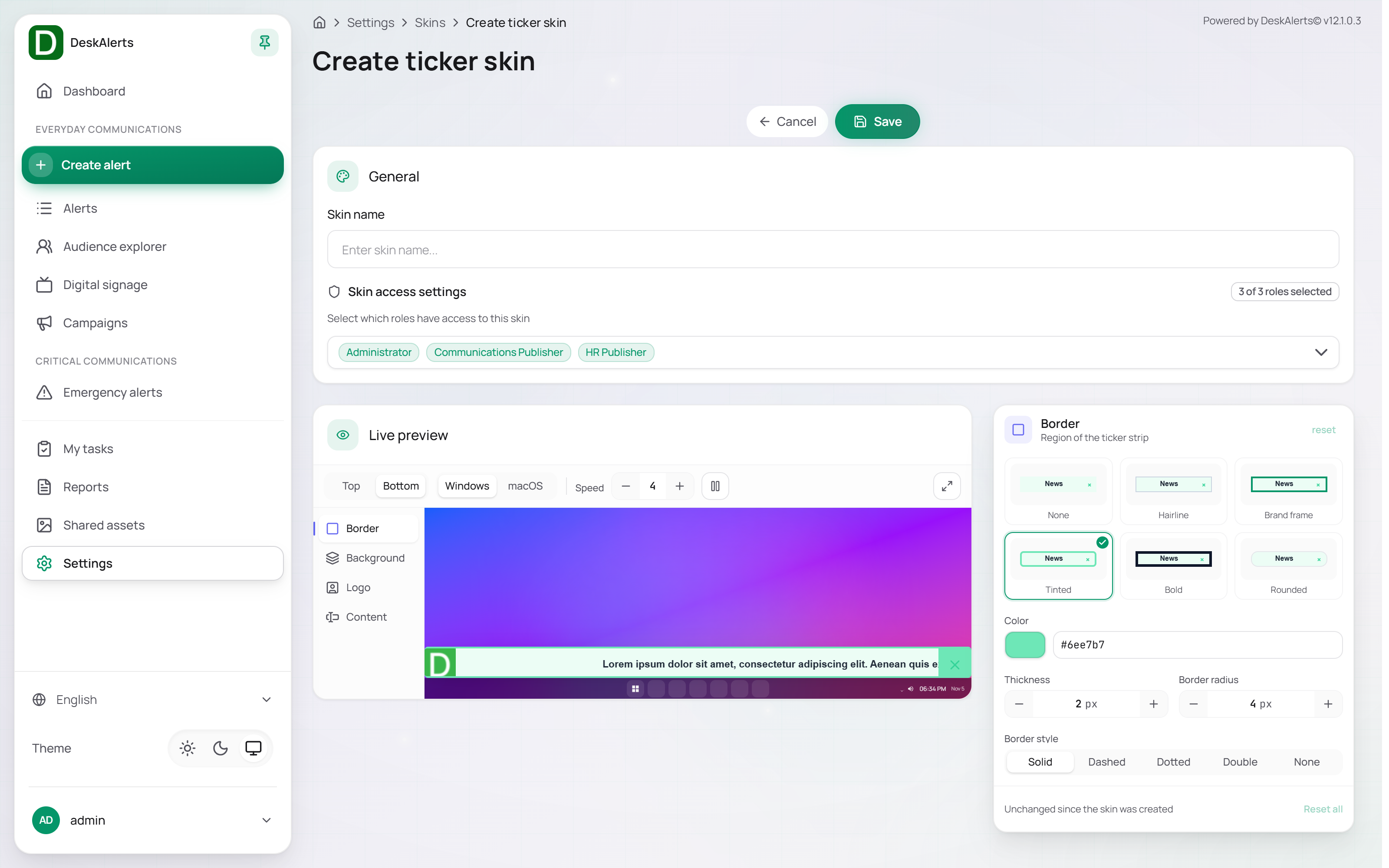 The region list of a ticker skin
The regions of the ticker strip are Border, Background, Logo, and Content. The Border region offers the presets None, Hairline, Brand frame, Tinted, Bold, and Rounded, and the settings Color, Thickness (px), Border radius (px), and Border style (Solid, Dashed, Dotted, Double, None); Background sets the colour of the strip, Logo the image on the left, Content the font, size and colour of the scrolling text and of the close button.
New popup and ticker defaults
This page defines the defaults applied to newly created popup and ticker alerts. Publishers can override these defaults on individual alerts during composition.
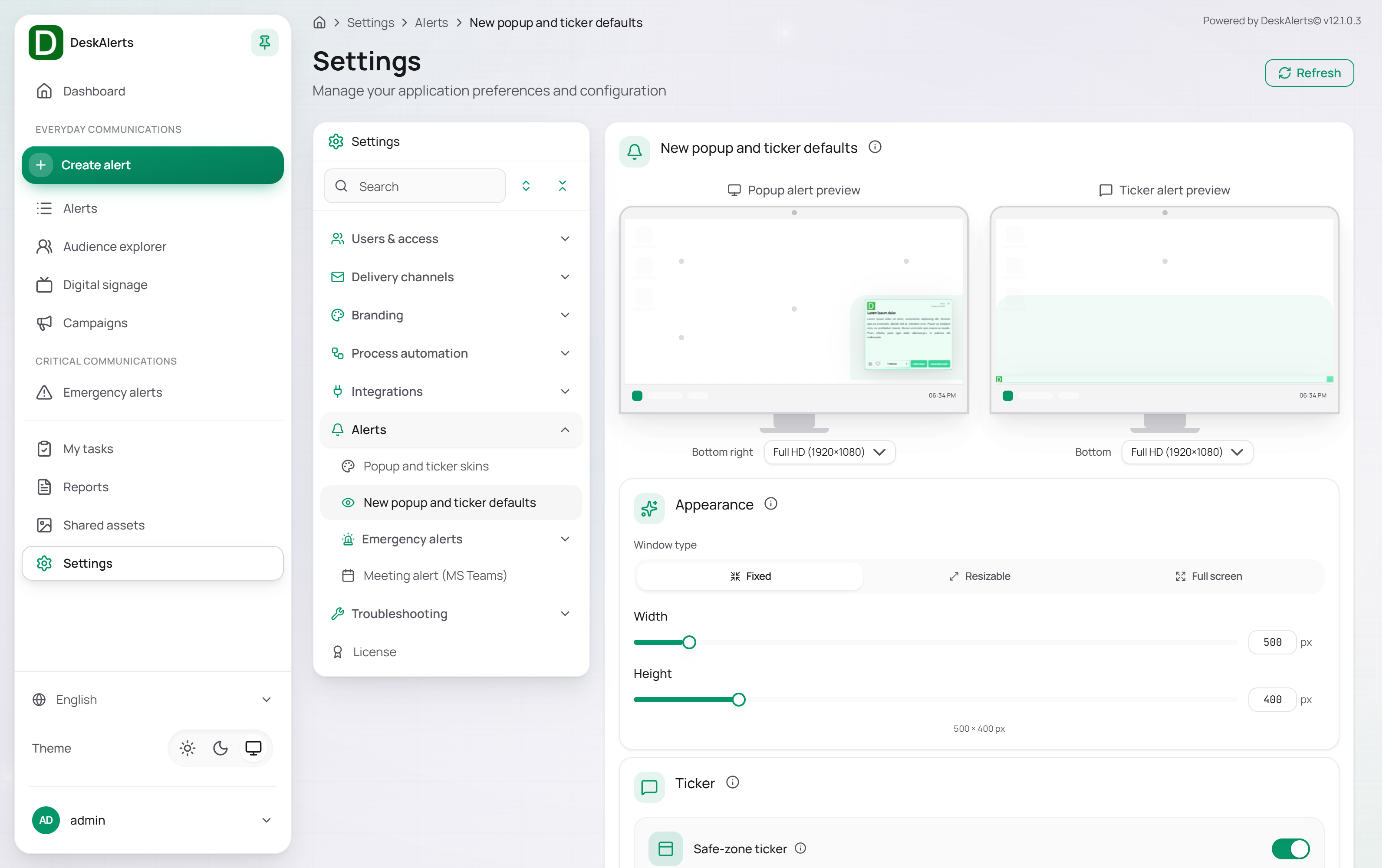 New popup and ticker defaults — previews and Appearance
The page is organized into the preview area at the top, followed by Appearance, Behavior, Timing, Print & feedback, and the delivery channels.
Click Save to apply changes, or Reset to discard unsaved changes.
Previews
The top of the page shows two side-by-side monitor previews:
| Preview | Description |
|---|---|
| Popup alert preview | Shows the default popup alert placement on a simulated desktop screen (for example, Bottom right). Click a position on the preview to change the default |
| Ticker alert preview | Shows the default ticker placement (for example, Bottom) |
Below each preview a screen resolution selector (for example, Full HD (1920×1080)) sets the reference resolution for the placement preview.
Appearance
| Setting | Description |
|---|---|
| Window type | Default popup alert window behavior: Fixed (set dimensions, non-resizable), Resizable (the recipient can resize), or Full screen (covers the entire display) |
| Width / Height | Default popup size in pixels, set via slider or direct input; the current size is shown as a summary (for example, 500 × 400 px) |
| Ticker | Safe-zone ticker — keeps the ticker inside the area of the screen that is not covered by the taskbar |
Behavior
| Setting | Description |
|---|---|
| Acknowledgement required | Requires recipients to click an Acknowledge button to close the alert. Disables the standard close button |
| Self-destruct | Removes the alert from the agent history automatically after the recipient closes it |
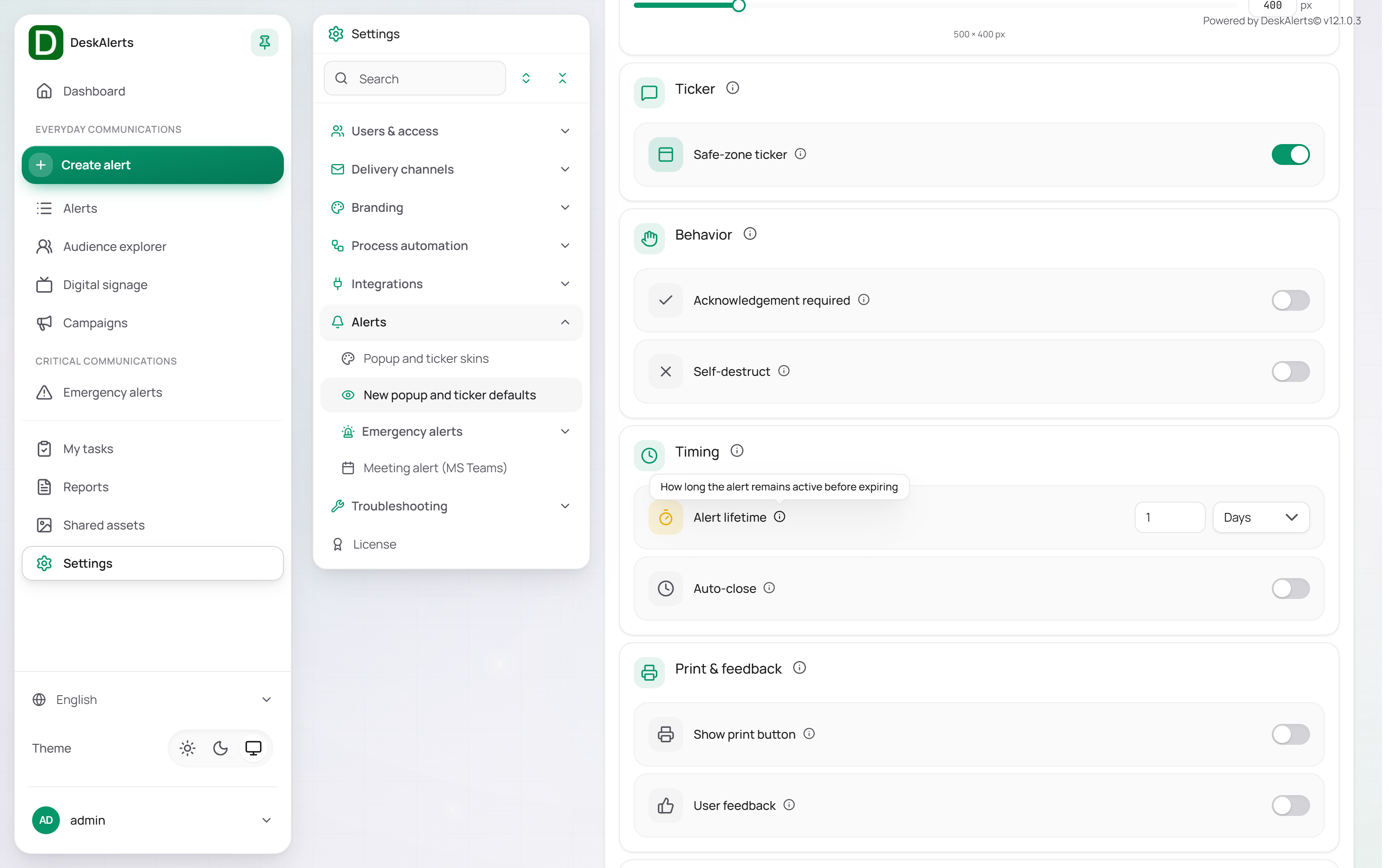 The lower part of the page
Timing
| Setting | Description |
|---|---|
| Alert lifetime | Defines how long the alert remains active and attempts to reach offline recipients. Value and unit (for example, Days) are configured separately |
| Auto-close | When enabled, automatically closes the alert after a configured time period |
Note: Enabling Acknowledgement required disables Auto-close; both settings cannot be active simultaneously.
Print & feedback
| Setting | Description |
|---|---|
| Show print button | Displays a print button inside the alert, allowing recipients to print the alert content |
| User feedback | Displays a Like button inside the alert. Feedback data is available in alert reports |
Delivery channels
The last section defines which channels are enabled by default for new alerts. Channels are presented as a row of toggle buttons: Desktop, Email, SMS, Mobile, Text to speech (the text-to-call channel), and MS Teams. Channels whose gateway is not configured under Delivery channels cannot be used by the alerts even when selected here.
Emergency alerts → Activation
The Activation page of the Emergency alerts sub-group defines whether an emergency button sends on the first tap or asks for a confirmation. The setting applies to the emergency buttons of the web portal, the web agent (PWA), the desktop agent, and the mobile agent.
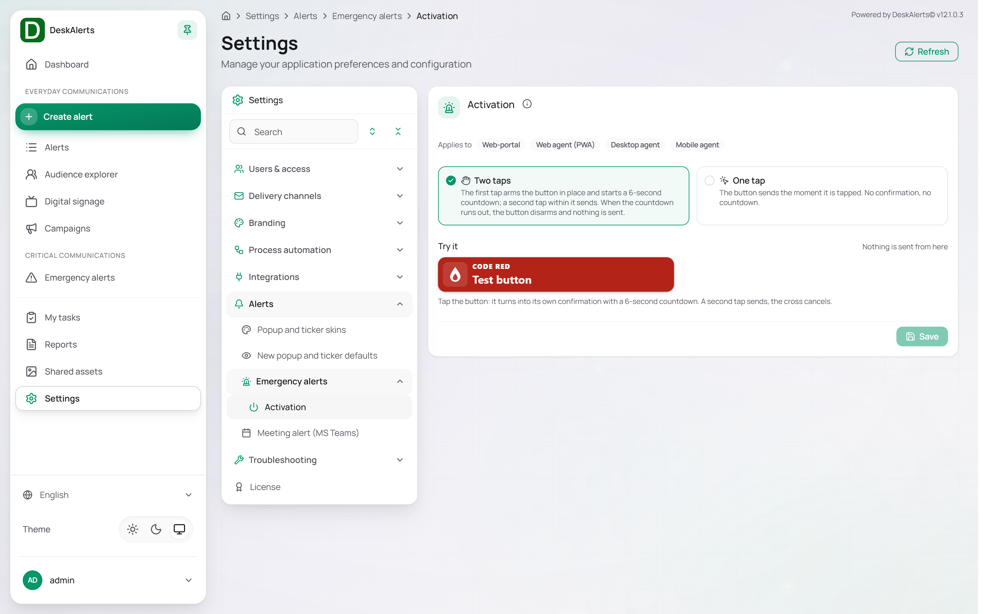 Emergency alerts — Activation
| Option | Behavior |
|---|---|
| Two taps | The first tap arms the button in place and starts a 6-second countdown; a second tap within it sends. When the countdown runs out, the button disarms and nothing is sent |
| One tap | The button sends the moment it is tapped. No confirmation, no countdown |
The Try it area holds a test button (CODE RED) that behaves like a real emergency button but sends nothing: tap it to see the armed state with its countdown, tap again to "send", or tap the cross to cancel. Click Save to apply the choice. The desktop agent shows the same armed state (ARMED, countdown, Send and the cross) in its tray window — see Agent recipient experience.
Related settings
- Settings → Delivery channels → SMTP server (emails) — required for the email channel
- Settings → Delivery channels → SMS portal and Text-to-call — required for the SMS and voice channels
- Settings → Delivery channels → MS Teams (text messages) — required for the MS Teams channel
- Settings → Users & access → Web-portal roles — the roles offered in Skin access settings
- Settings → Branding → Fonts — the fonts offered in the skin editors