Alerts
Overview
Alerts are the everyday communications of DeskAlerts — notifications, announcements, invitations, surveys, and desktop-environment changes delivered from the web portal to the desktop agent, the mobile app, and auxiliary channels such as email, SMS, MS Teams, and digital signage screens. Every alert has a type that defines its format and the options available when you create it.
The Alerts page under Everyday communications is where alerts are created and managed. It has three parts: the Create everyday comms panel with a tile for every alert type, the Alerts tab with the list of alerts, and the Templates tab with reusable alert templates.
Emergency alerts have their own module — see Emergency alerts.
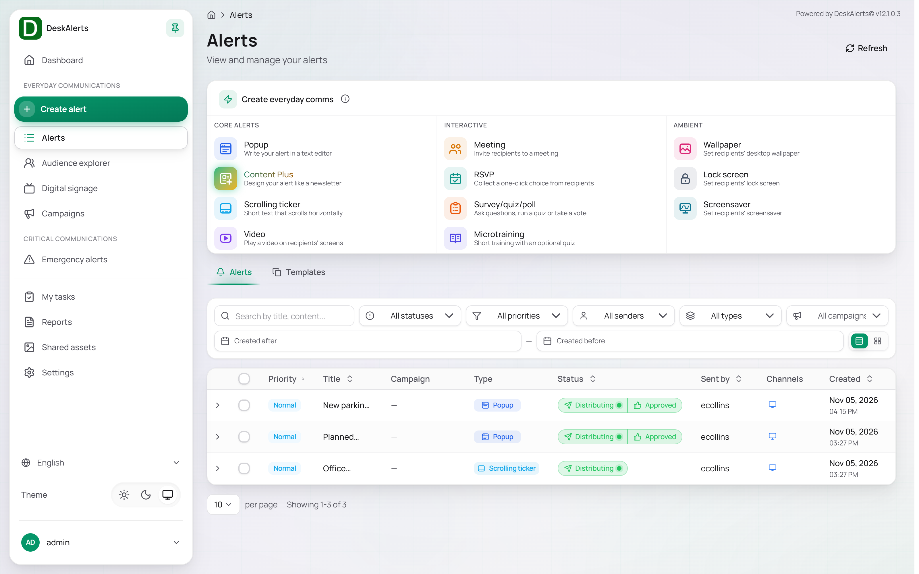 The Alerts page
Alert types
| Category | Type | Description |
|---|---|---|
| Core alerts | Popup | Write your alert in a text editor — a popup window on the recipient's desktop or mobile device, the most common format |
| Content Plus | Design your alert like a newsletter, in a drag-and-drop block editor | |
| Scrolling ticker | Short text that scrolls horizontally along the top or bottom of the screen without interrupting the user | |
| Video | Play a video on recipients' screens | |
| Interactive | Meeting | Invite recipients to a meeting — date, time, location, and duration |
| RSVP | Collect a one-click choice from recipients, with an optional free-text question | |
| Survey/quiz/poll | Ask questions, run a quiz or take a vote; the answers are collected in reports | |
| Microtraining | Short training with an optional quiz | |
| Ambient | Wallpaper | Set recipients' desktop wallpaper |
| Lock screen | Set recipients' lock screen | |
| Screensaver | Set recipients' screensaver |
Click a tile in the Create everyday comms panel to open the creation page for that type. The same tiles are available in the Create alert menu of the navigation panel and on the Dashboard, and an alert can also be started from a selected audience in Audience explorer.
Alerts tab
The Alerts tab lists every alert on the server, newest first. A new installation shows No alerts found — Create your first alert to start communicating with a New alert button.
| Column | Description |
|---|---|
| Priority | Normal or High |
| Title | The alert title |
| Campaign | The campaign the alert belongs to, or — |
| Type | The alert type |
| Status | The lifecycle status — see Alert statuses |
| Sent by | The web-portal user who created the alert |
| Channels | Icons of the delivery channels |
| Created | Date and time of creation |
Filtering
| Control | Description |
|---|---|
| Search by title, content… | Free-text search |
| All statuses | Distributing, Draft, Planned, Recurring, Expired, Stopped, Approved, Rejected |
| All priorities | High or Normal |
| All senders | Alerts created by one web-portal user |
| All types | One alert type, grouped by category |
| All campaigns | Alerts of one campaign |
| Created after / Created before | Alerts created within a date range |
| Table / Cards | Switches between the table and a card layout |
Alert actions
Click a row to reveal the actions for that alert:
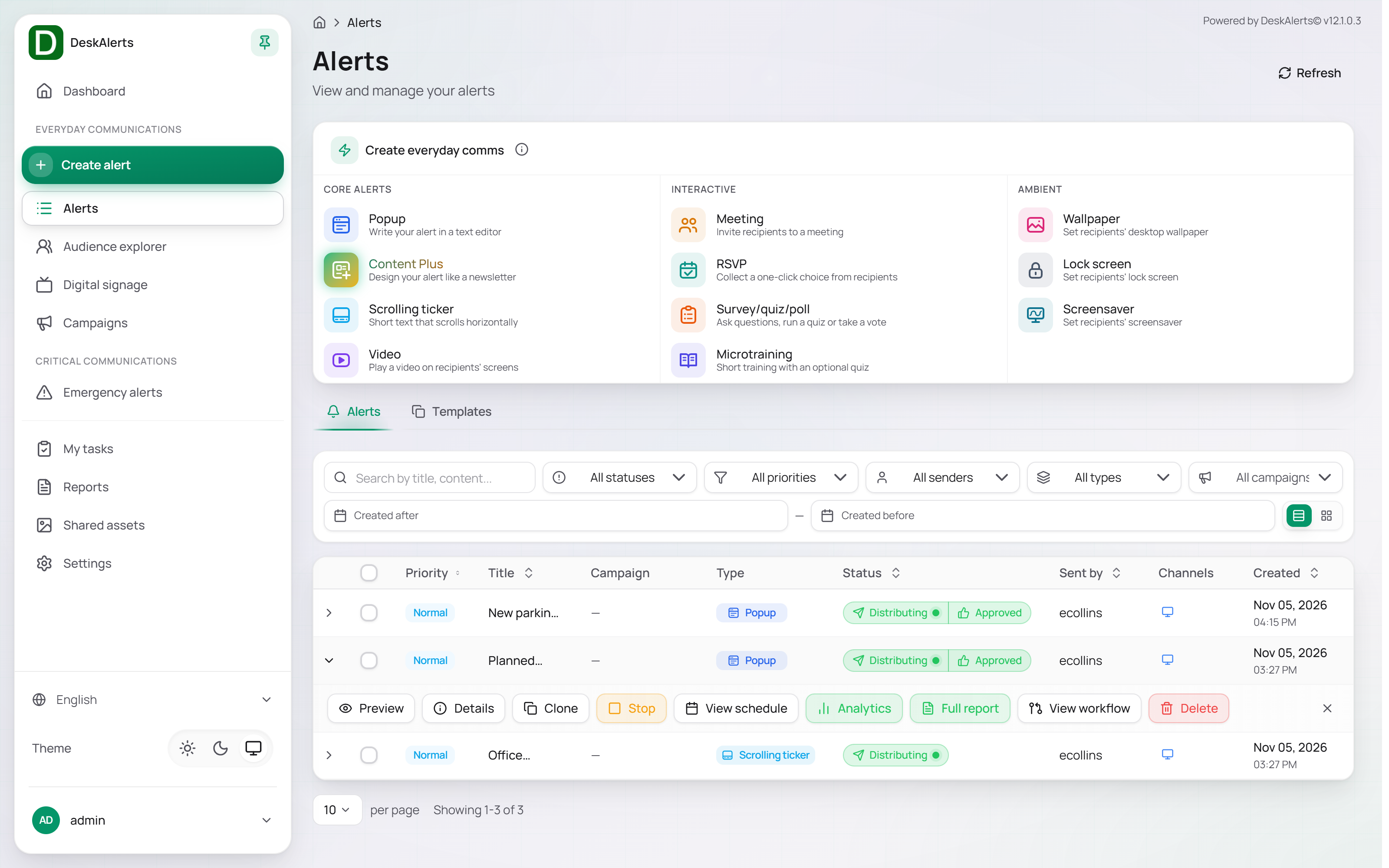
| Action | Description |
|---|---|
| Preview | Shows the alert as recipients see it — on a simulated Windows or macOS desktop at a chosen resolution |
| Details | Opens the alert details dialog — title, priority, recipients, active time, position, color code, channels, and a live preview |
| Clone | Creates a copy of the alert and opens it in the wizard, so you can adjust it and send it again — for example, to resend an expired alert |
| View schedule | Shows the alert's status and its Start at and End at times |
| Analytics | Opens the quick delivery report — target audience, channels, elapsed and remaining time, resolved audience |
| Full report | Opens the Alert tracking report on the Reports page |
| Stop | Shown for an alert that is Distributing. Stops delivery immediately; the status changes to Stopped |
| Delete | Deletes the alert and its delivery records |
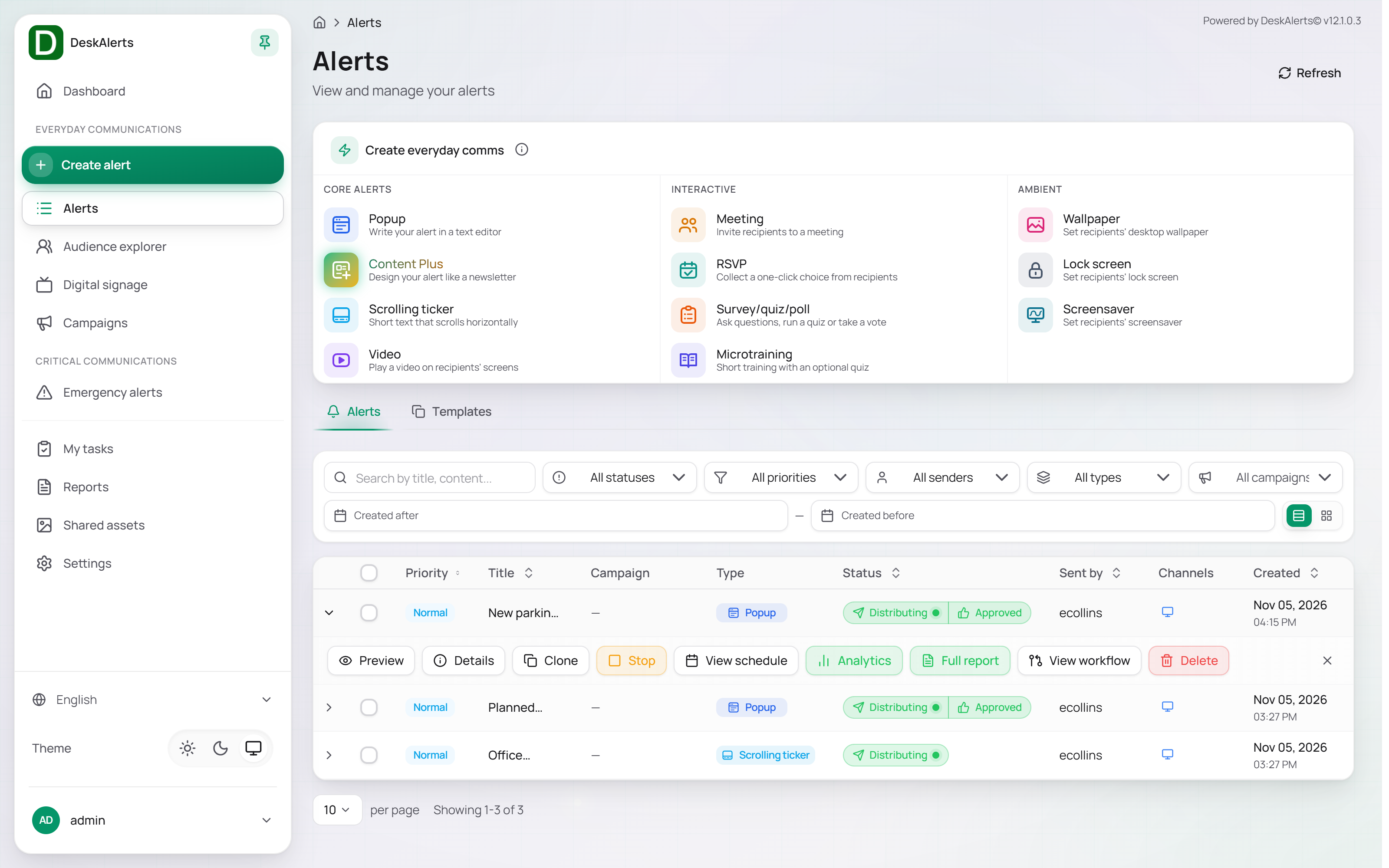 An active alert offers Stop in addition to the other actions
Select alerts with the checkboxes at the start of the rows (or Select all rows in the header for the whole page) to delete several alerts at once with Delete selected; the deletion happens at once, without a confirmation dialog, and the toast Alert(s) deleted successfully confirms it.
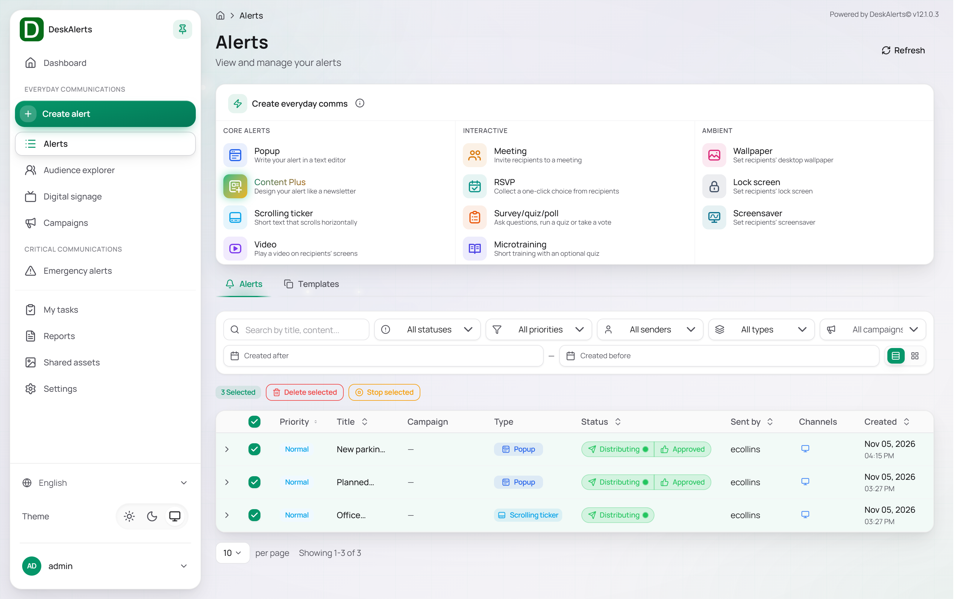
Alert statuses
| Status | Description |
|---|---|
| Draft | Saved with Save draft but not sent. Drafts can be edited and sent at any time |
| Planned | Scheduled for a future start time |
| Distributing | Being delivered to recipients |
| Recurring | Repeats on a schedule and is currently active |
| Stopped | Delivery was stopped manually |
| Expired | The active period has ended |
| Pending approval | Sent, but waiting for a decision in an approval workflow — the alert is not delivered yet |
| Approved / Rejected | The decision of the approval workflow. An approved alert continues to Distributing and keeps an Approved badge next to its status |
 The same alert after approval
Templates tab
The Templates tab holds alert templates — saved alert content that can be reused when creating alerts. A new installation ships 40 ready-made popup templates (for example, Standard System Test, Routine Workplace Safety Reminder, Benefits Open Enrollment is Active, and office-closure notices in several languages). Templates are created with New template or with the Save button next to the Template selector in the Content section of the composer.
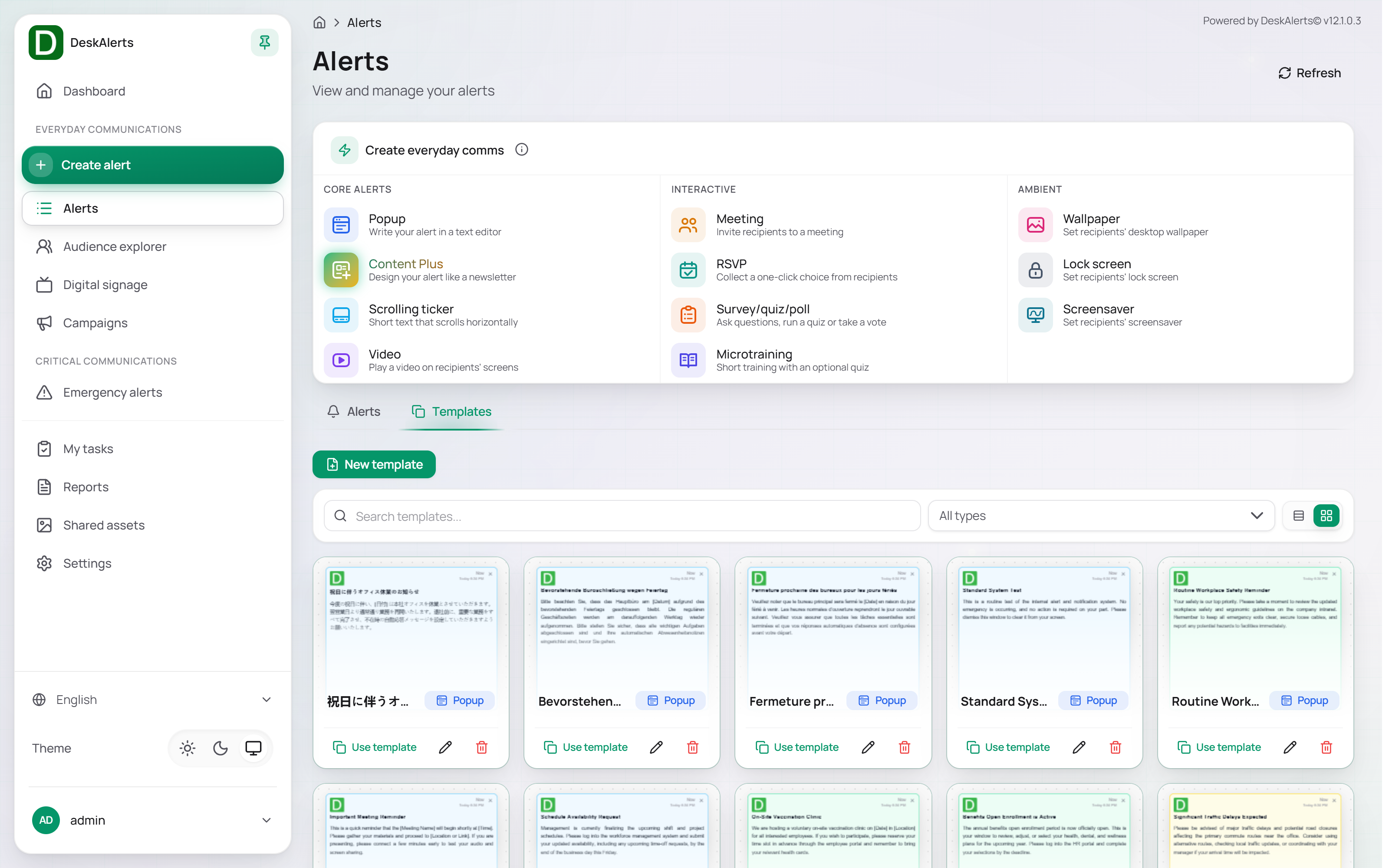 The Templates tab
Each template card shows a preview, the template name, and the alert type. Use template starts a new alert of that type with the template's content; Edit template and Delete appear when you move the mouse over the card. Use Search templates… and the All types filter to find a template.
Form templates in HTML
A template can be written as HTML with form fields — text inputs, drop-downs, radio buttons — that the publisher fills in when sending (the usual pattern for color-coded incident notices such as Code Yellow). The desktop agent recognizes a few conventions in such HTML:
| Convention | Effect |
|---|---|
A <table class="flatView"> whose rows pair a <th> label with a <td> that holds one input or select | The recipient sees only the entered values as a flat table, not the form controls |
An element with the class close-window-command | Closes the alert when clicked |
An element with the id acknowledgmentOk | Records the acknowledgement in the statistics and closes the alert |
An element with the id printButton | Prints the alert |
An element with the id userFeedbackDiv | Records a Like in the statistics |
The class hide-for-publisher (with .hide-for-publisher { display: none; } in the template's styles) | Hides the element — typically the buttons — while the publisher fills in the form; the class is removed when the alert is sent or previewed |
The buttons work both in the alert body and inside an <iframe> of the template.
Creating an alert
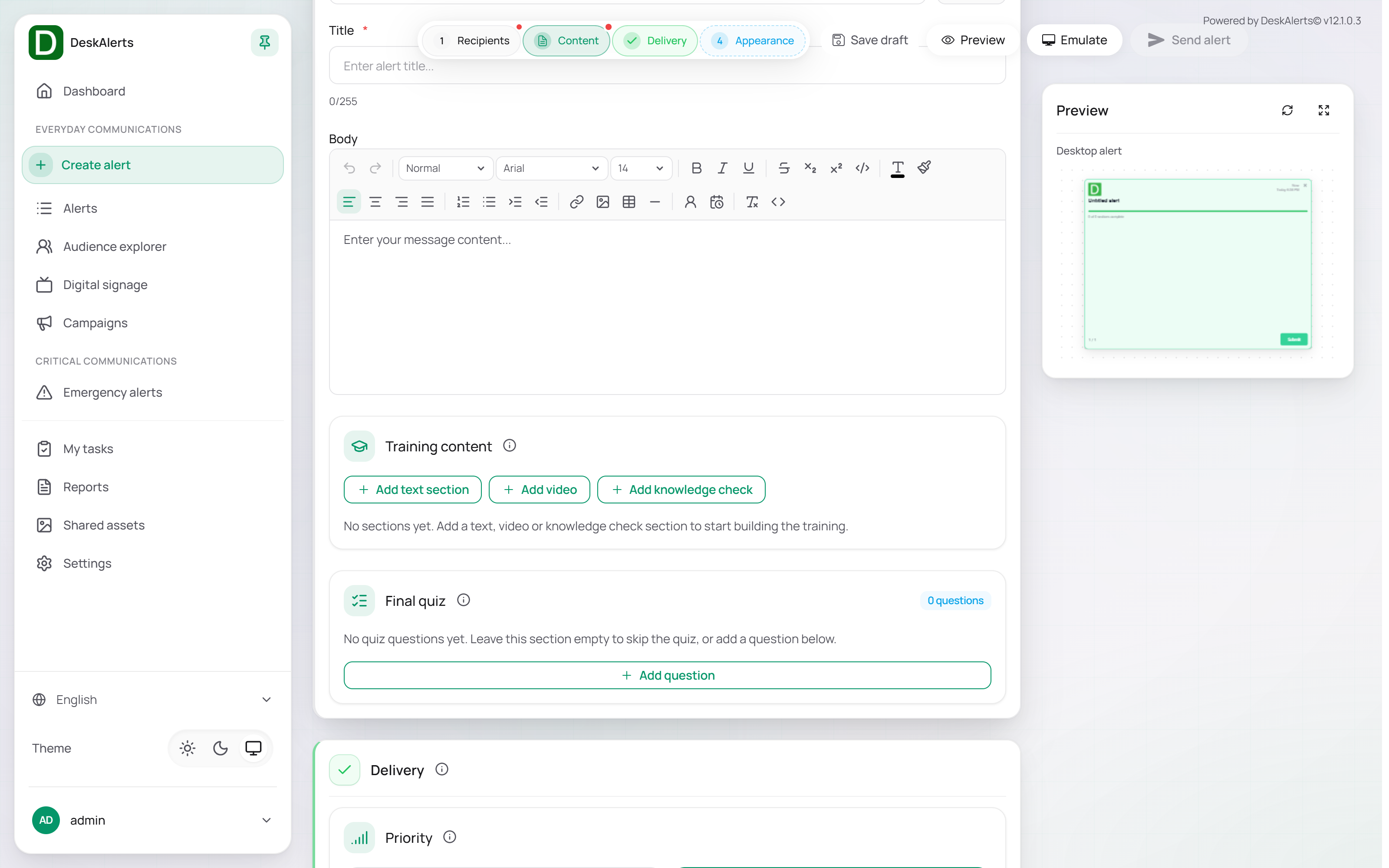
Every alert type opens the same kind of page — Create popup alert, Create scrolling ticker alert, and so on: a single scrolling page divided into numbered sections, with a step indicator at the top. Sections that still need input are marked; completed sections show a check mark. You can fill in the sections in any order. The toolbar has Save draft, Preview, Emulate (shows the alert as the agent would display it), and Send alert; a live preview of the desktop alert is shown on the right.
The sections common to most alert types are described once here; the type-specific sections follow.
Recipients
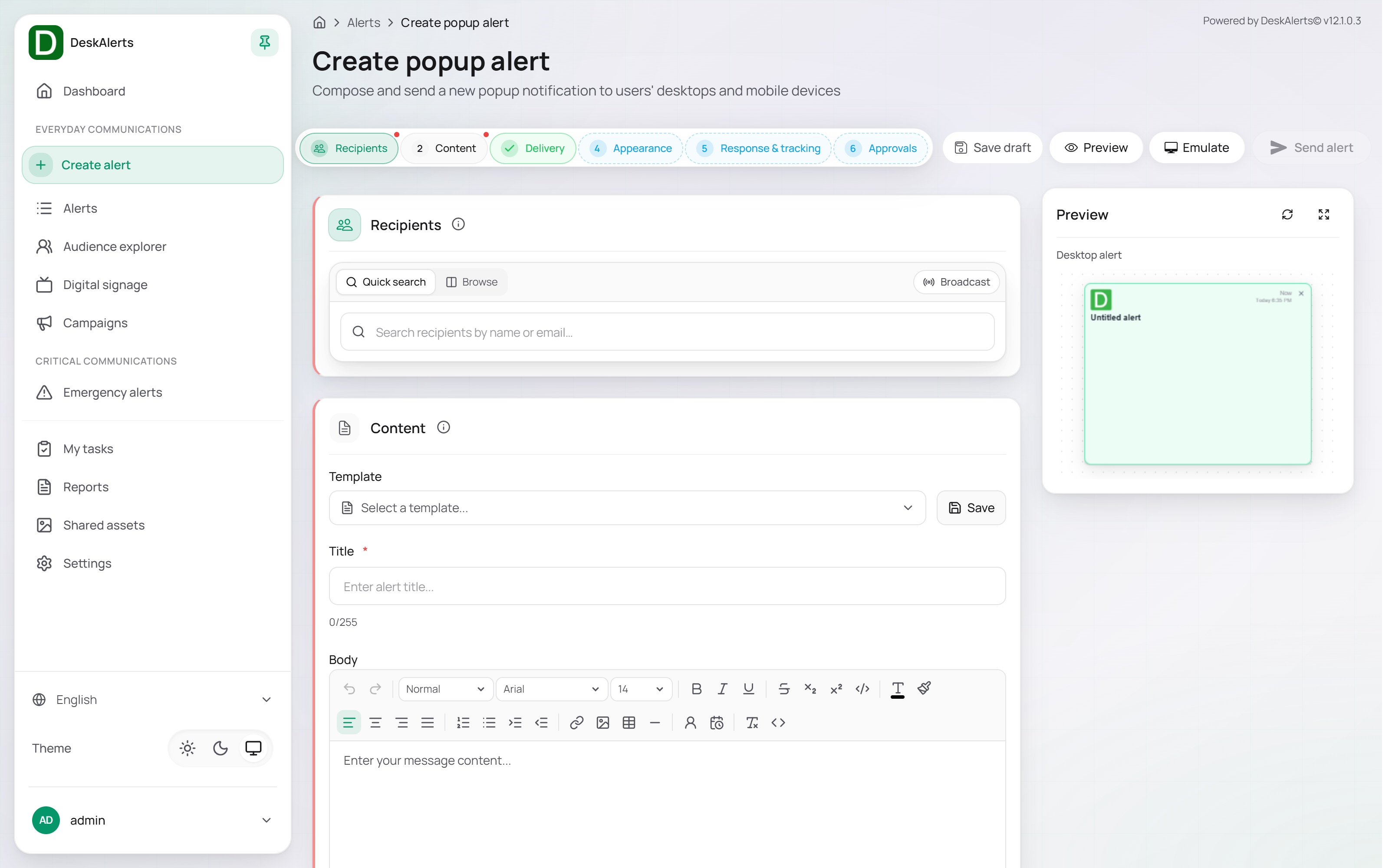
| Mode | Description |
|---|---|
| Quick search | Type a name or email into Search recipients by name or email… and pick the match — a user, a group, an organizational unit, a computer, or an IP group. Hold Shift to pick several; paste a list to add many at once |
| Browse | Pick recipients from the audience tree, tab by tab |
| Broadcast | Everyone on the server |
The selected recipients are listed in the section with their type and the total count.
Content
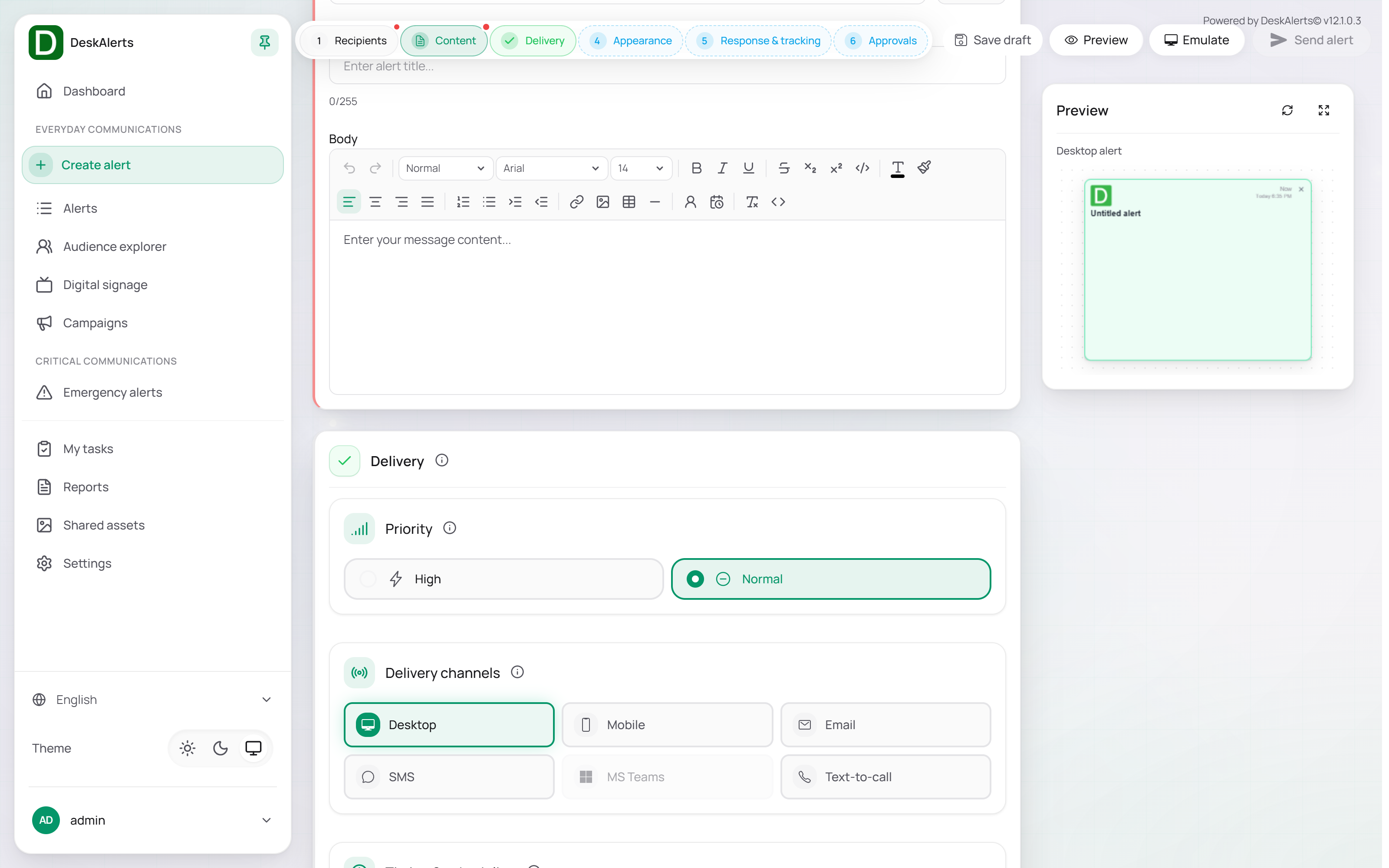
| Field | Description |
|---|---|
| Template | Pre-fill the content from a saved template (Select a template…). Save stores the current content as a new template |
| Title (required) | The headline, up to 255 characters (the counter shows 0/255) |
| Body | The message, edited in the rich-text editor — paragraph styles, fonts and sizes, formatting, alignment, lists, links, images, tables, and an HTML view |
Delivery
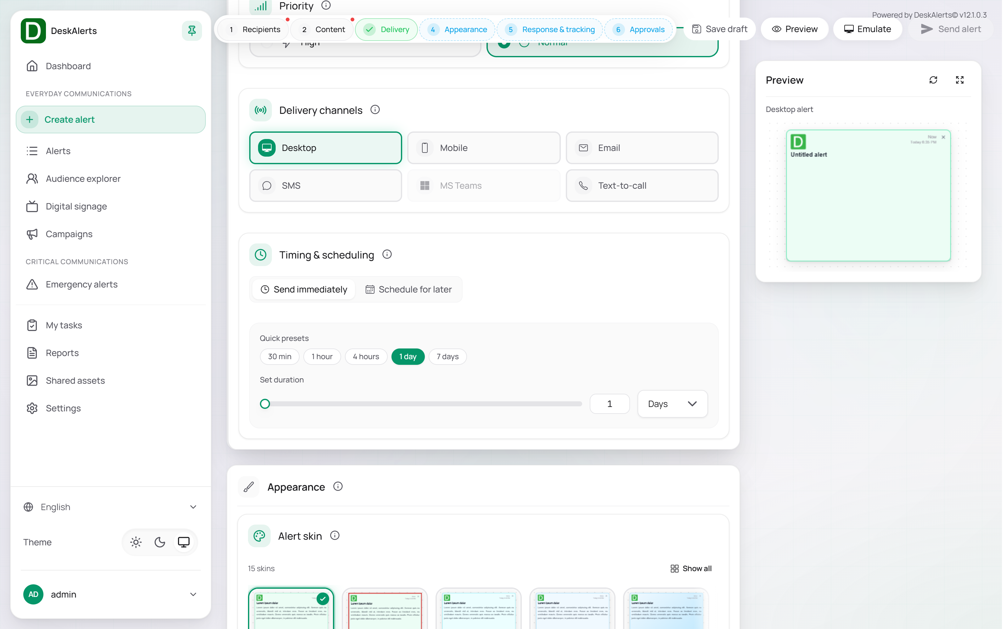
| Setting | Description |
|---|---|
| Priority | Normal or High — a High priority alert is more prominent on the agent and plays a sound |
| Delivery channels | The channels the alert is sent through: Desktop, Mobile, Email, SMS, MS Teams, Text-to-call, and, for tickers, Digital signage. The available channels depend on the alert type; a channel whose gateway is not configured under Settings → Delivery channels does not deliver |
| Timing & scheduling | Send immediately or Schedule for later with a Start date & time and the Repeat this alert switch for recurring alerts. The duration — how long the alert stays active — is set with a Quick preset (30 min, 1 hour, 4 hours, 1 day, 7 days) or Set duration in minutes, hours, or days. For a recurring alert that ends after a number of occurrences, set the duration so that it covers the whole series |
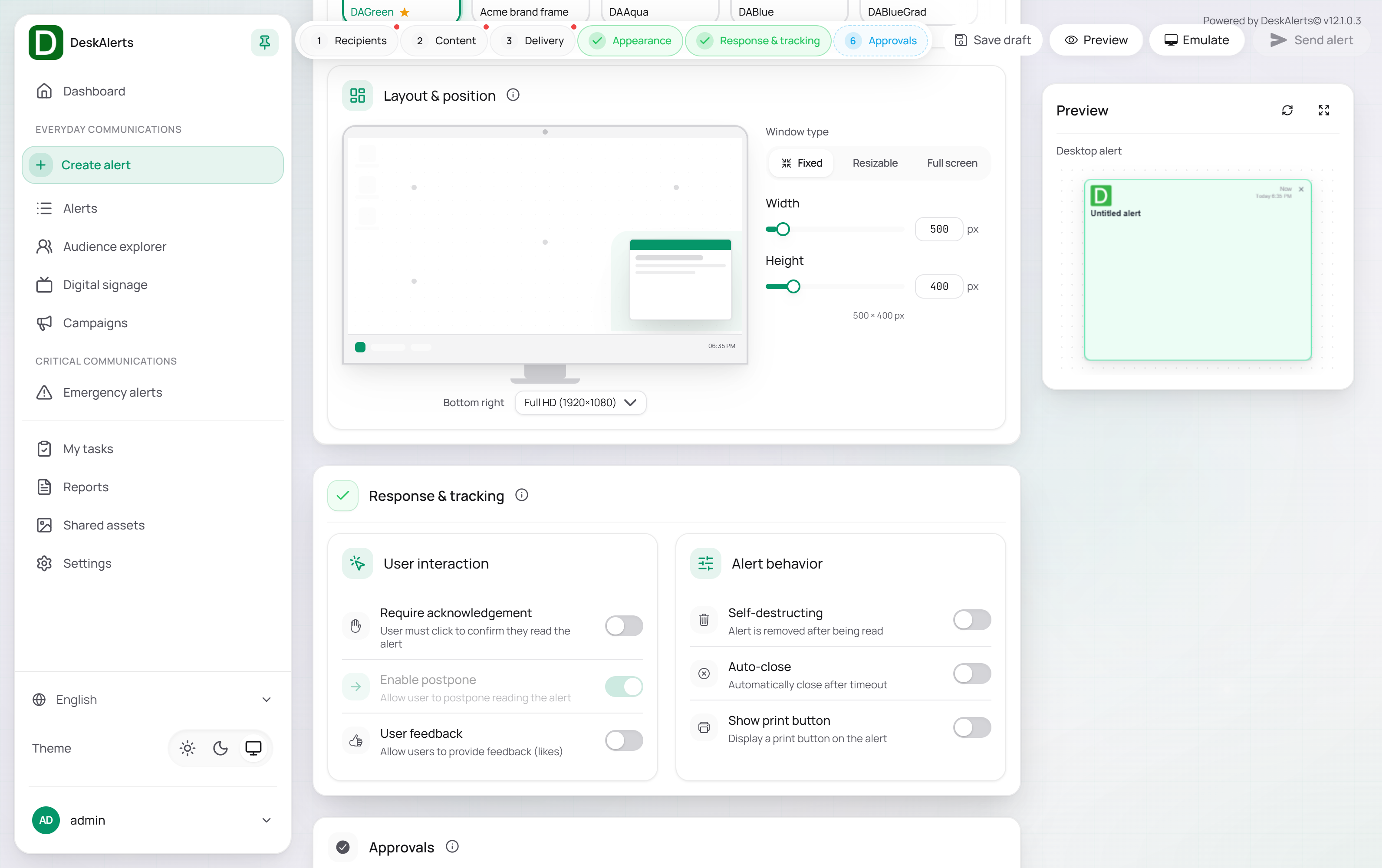 Scheduling an alert
Appearance
| Setting | Description |
|---|---|
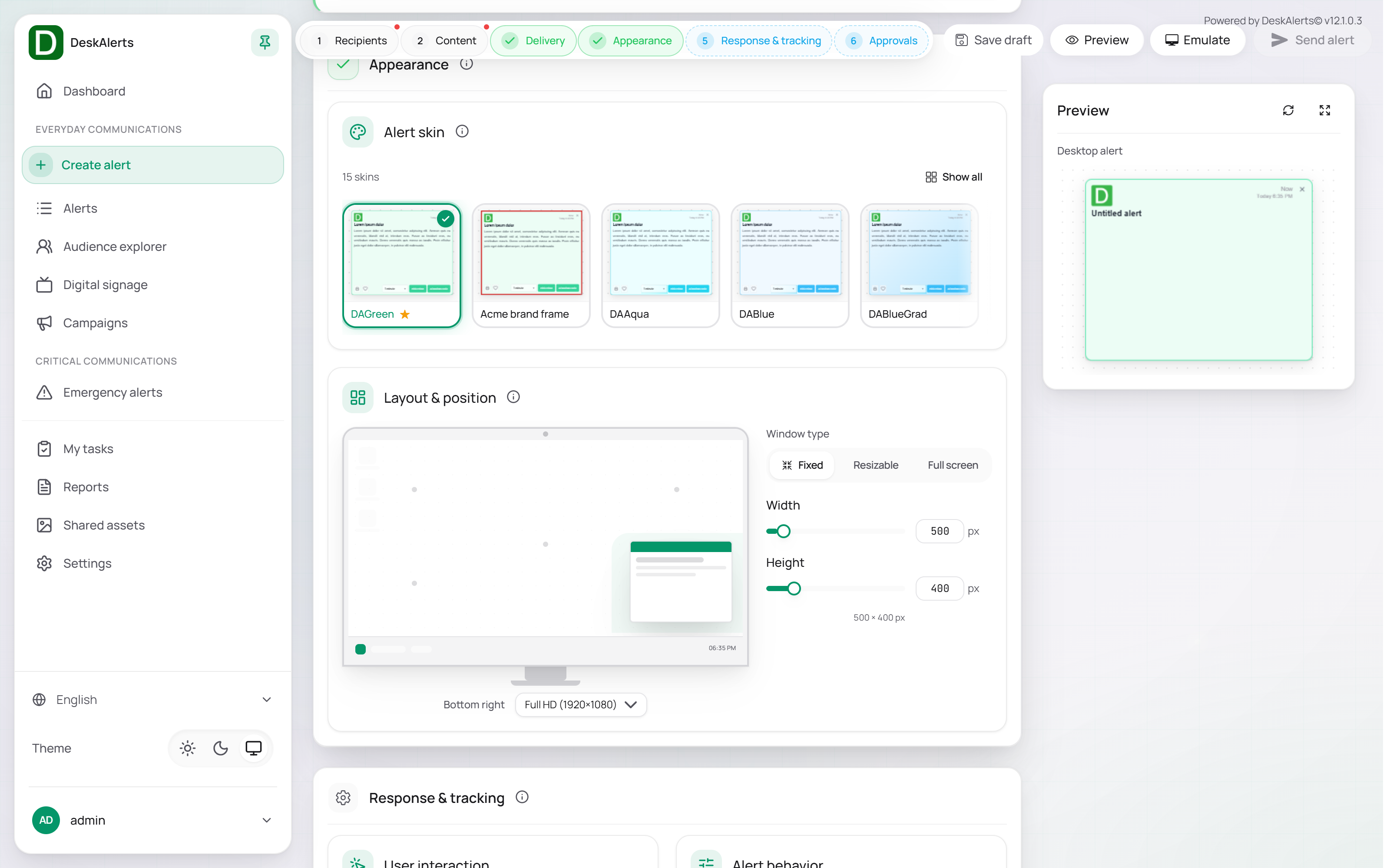
| Alert skin | The visual theme of the alert: the built-in skins (DAGreen is the default) and the skins created under Settings → Alerts → Popup and ticker skins (for example, Acme brand frame). Click Show all to see every skin |
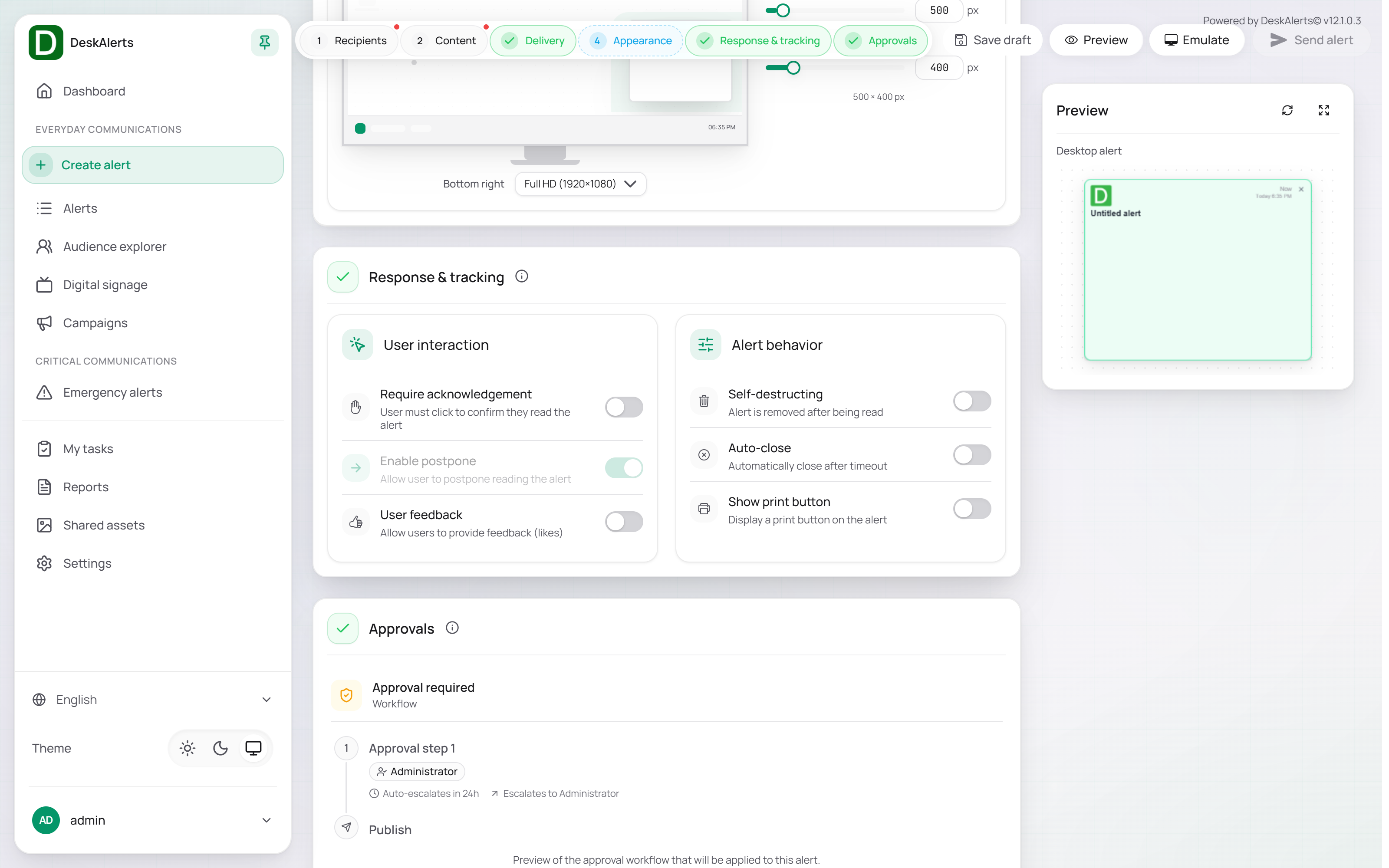
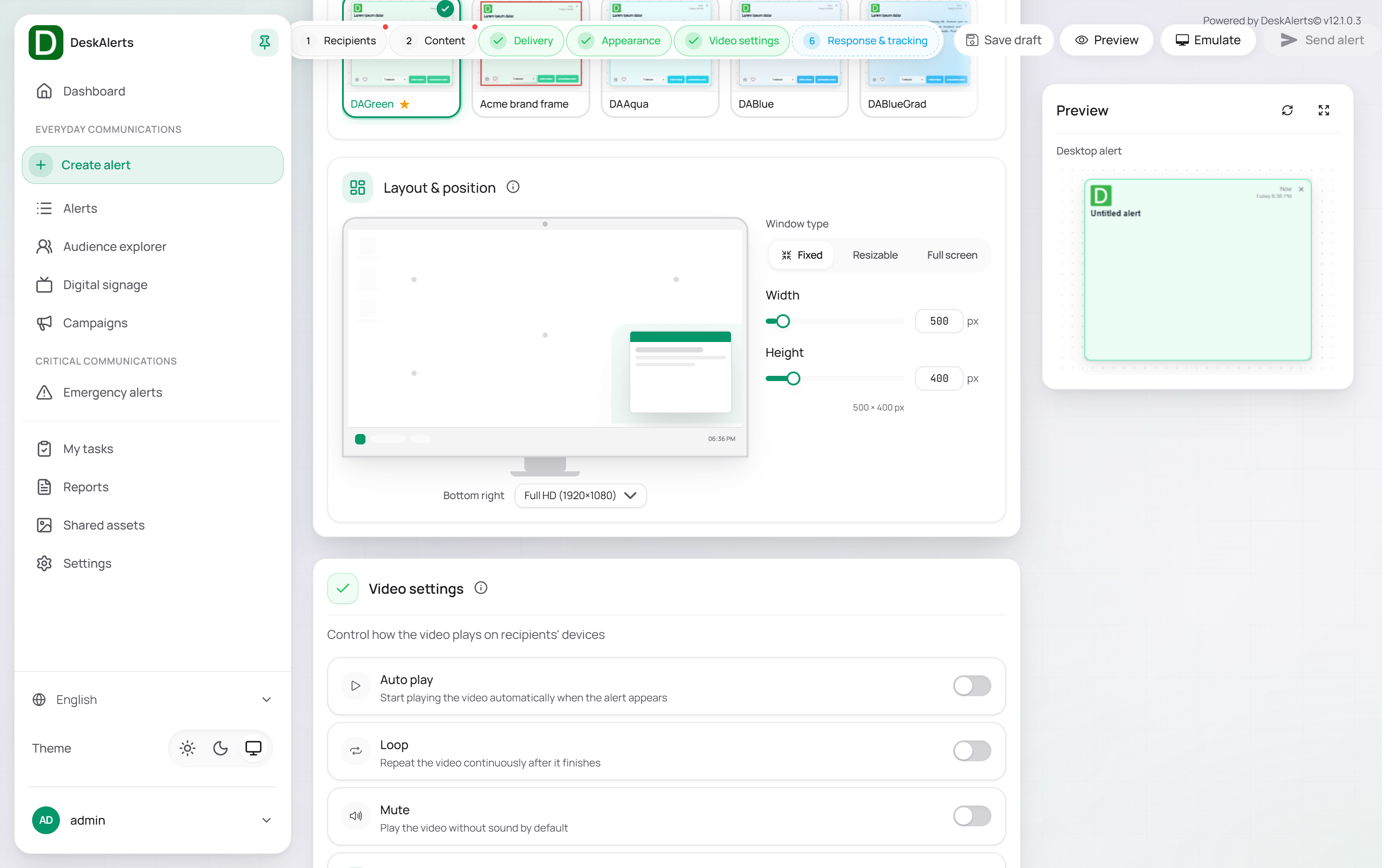
| Layout & position | The on-screen position chosen on a screen diagram for the selected resolution (for example, Bottom right, Full HD (1920×1080)), the Window type (Fixed, Resizable, or Full screen), and Width and Height in pixels (500 × 400 px by default) |
Response & tracking
| Setting | Description |
|---|---|
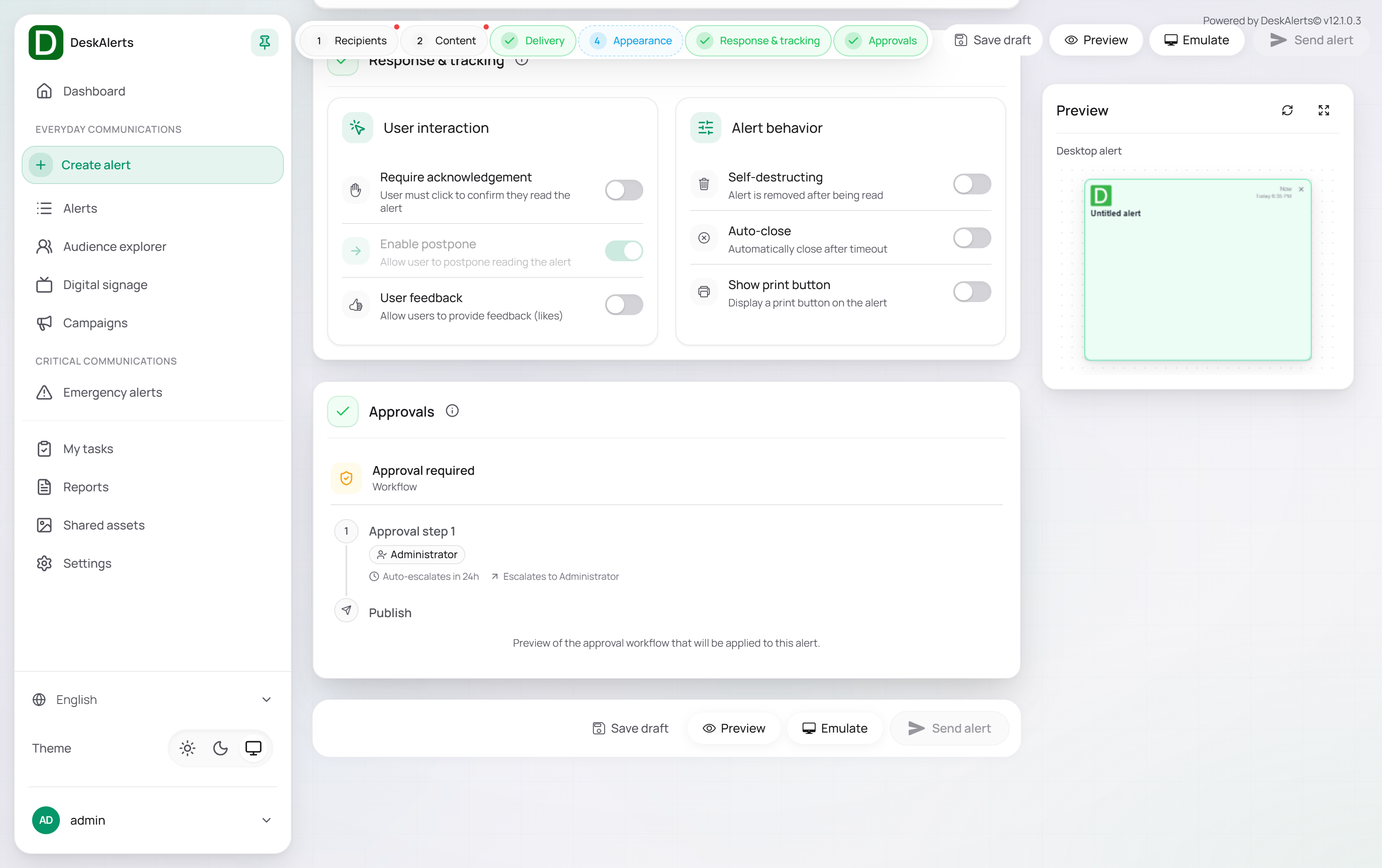
| Require acknowledgement | The user must click to confirm they read the alert; the alert cannot be dismissed without acknowledging it |
| Enable postpone | Allows the user to postpone reading the alert (offered together with acknowledgement) |
| User feedback | Allows users to provide feedback (likes) |
| Self-destructing | The alert is removed after being read |
| Auto-close | Automatically closes the alert after a timeout |
| Show print button | Displays a print button on the alert |
Approvals
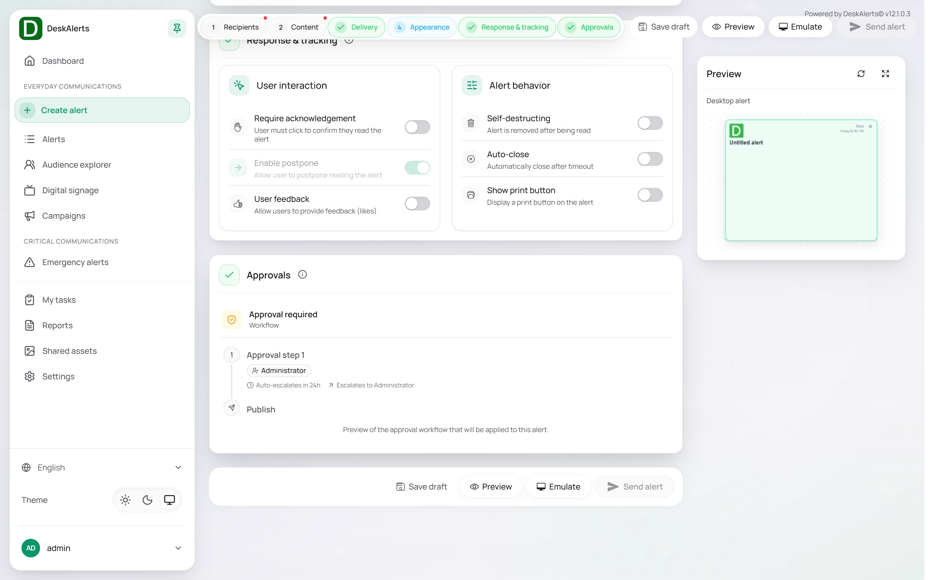
Shows whether the alert is subject to an approval workflow. If a dispatch rule matches the alert (for example, by alert type, channel, or sender role), the section shows Approval required with a preview of the workflow — each approval step with its approver role and escalation (Approval step 1 — Administrator — Auto-escalates in 24h — Escalates to Administrator), ending with Publish. After you send such an alert, it gets the status Pending approval and waits in the approvers' My tasks inbox. Rules and workflows are configured under Settings → Process automation — see Process automation.
Sending
Click Preview to check the alert, then Send alert. The confirmation dialog summarizes the alert — title, priority, recipients, active time, position, size, skin, channels, and the enabled options — next to a preview. Confirm to send. The alert is sent immediately or at the scheduled time and appears in the Alerts tab with the toast Alert sent successfully! — also when it went to Pending approval, so check the status in the list. Save draft stores the alert without sending it.
Type-specific sections
Popup
The popup page consists of the six common sections above: Recipients, Content, Delivery, Appearance, Response & tracking, and Approvals.
Content Plus
Content Plus alerts are composed in a drag-and-drop block editor instead of the rich-text editor. The Content section shows a canvas with the alert and a Blocks panel with the building blocks; select a block on the canvas to edit it in the Properties panel. The sections of the page are Recipients, Content, Appearance, Delivery, and Response & tracking.
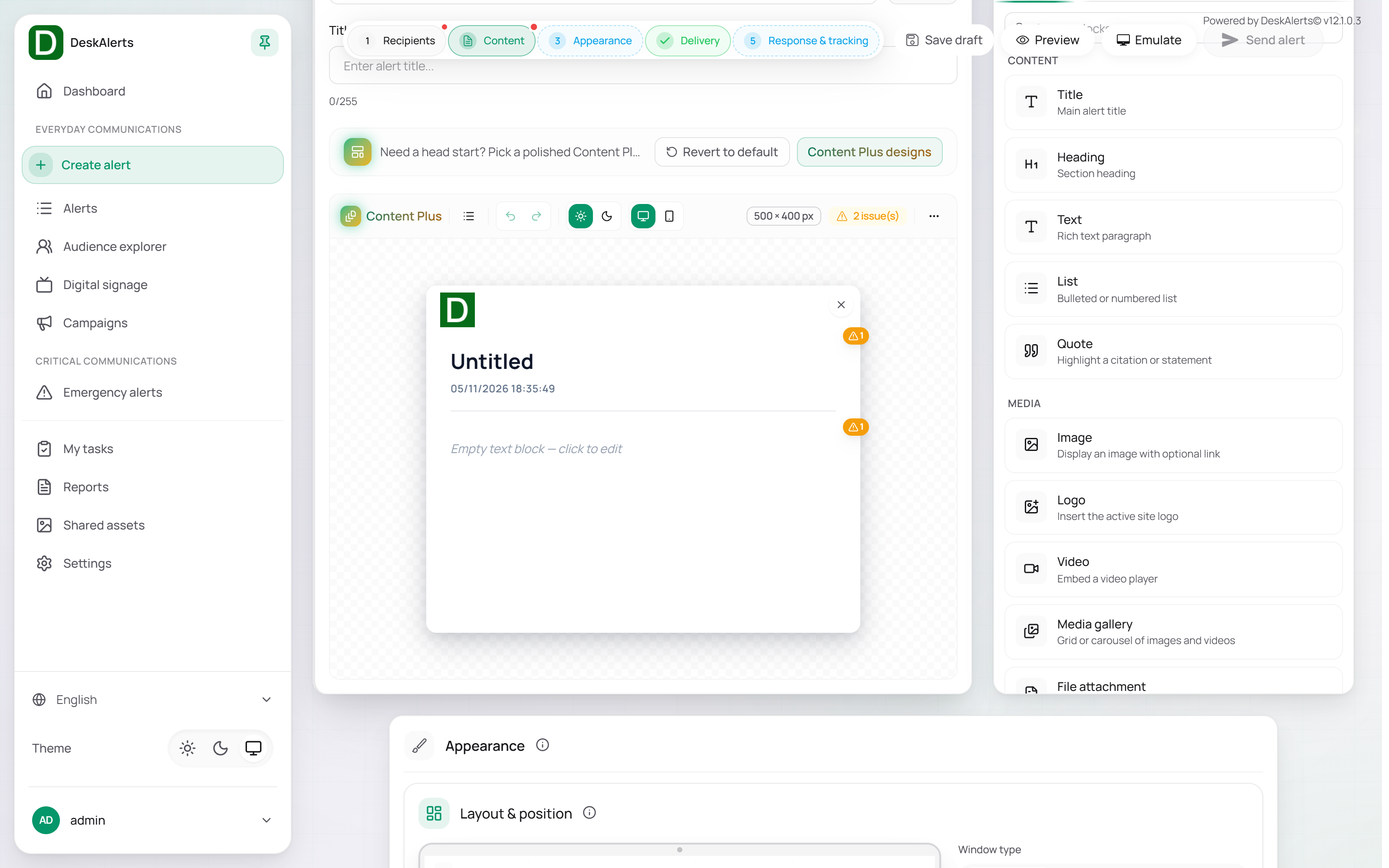
| Block group | Blocks |
|---|---|
| Content | Title, Heading, Text, List, Quote |
| Media | Image, Logo, Video, Media gallery, File attachment, Date sent |
| Interactive | Button, Social |
| Layout | Columns, Accordion, Tabs, Divider, Spacer |
| Advanced | Custom HTML |
Content Plus designs offers ready-made designs to start from; Revert to default restores the empty canvas. The editor toolbar provides undo and redo, light and dark preview, desktop and mobile preview, and an issue counter for blocks that still need content. The other sections are the same as for Popup alerts.
Scrolling ticker
| Section | Difference |
|---|---|
| Delivery | Channels: Desktop, Mobile, SMS, MS Teams, Text-to-call, and Digital signage — a ticker can run on digital signage screens |
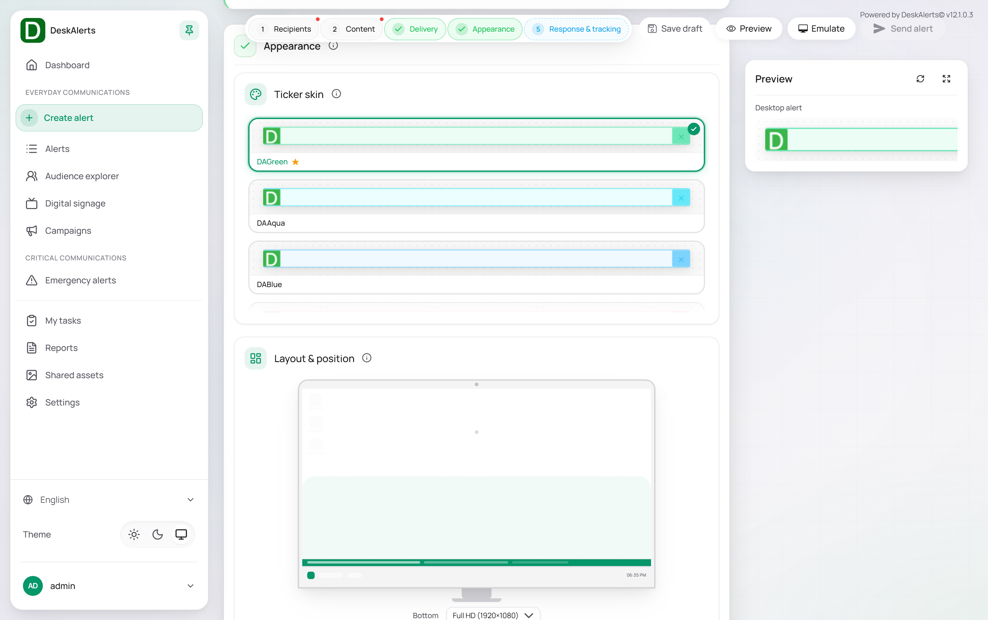
| Appearance | A ticker skin instead of an alert skin; Layout & position places the strip at the top or bottom of the screen; Ticker speed sets the scroll speed (the confirmation dialog shows it, for example Ticker speed 4) — lower values are easier to read, higher values increase urgency |
On the recipient's desktop the ticker is a strip across the full width of the screen at the chosen edge, with the text scrolling and the current time and date on the right — see Agent recipient experience.
Video
| Section | Difference |
|---|---|
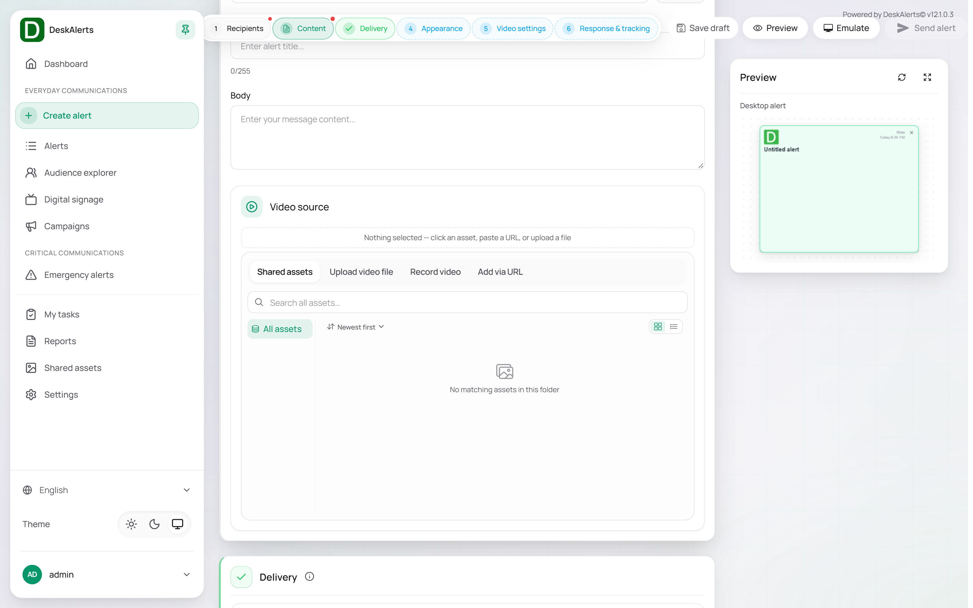
| Content | The message is a plain text field, followed by the Video source: pick a video from Shared assets, upload a video file, record a video with the camera, or add it via URL |
| Delivery | Channels: Desktop and Mobile |
| Video settings | Auto play (start playing when the alert appears), loop, mute, and the player controls |
Videos are streamed from the server when the alert opens, not downloaded to the device beforehand. The portal accepts MP4, WebM, OGG, AVI, MOV, and WMV files; files that are not MP4 are converted to MP4 on upload so that the portal preview can play them. Use MP4 with H.264 video for the widest compatibility.
Upload size limits:
| Server | Default limit | Where to change it |
|---|---|---|
| Docker deployment | 100 MB — the nginx limit DESKALERTS_MAX_CONTENT_SIZE=100M (and DESKALERTS_MAX_CONTENT_BYTES) in deploy/.env; the server itself accepts up to 200 MB | deploy/.env, then bash scripts/start.sh |
Showing a video over the whole screen. Set Appearance → Layout & position → Window type to Full screen: the agent opens the alert window over the entire monitor. The video is placed under the title and text at the width of the window, so its height depends on the video's aspect ratio — a video with the monitor's aspect ratio fills the screen; on a wider monitor (for example 21:9) a 16:9 video is taller than the screen and its lower part and controls are reached by scrolling. To leave only the video, use an alert skin without logo, date and title and with the content padding set to 0 (see Alert appearance); a thin strip with the close button stays at the top. The fullscreen button of the video player enlarges the video to the alert window only, not to the screen.
Content Plus alerts can also carry a video: drag the Video block onto the canvas and pick a file from Shared assets. With Auto play on, the editor also turns on Muted, because browsers start a video automatically only without sound.
Meeting
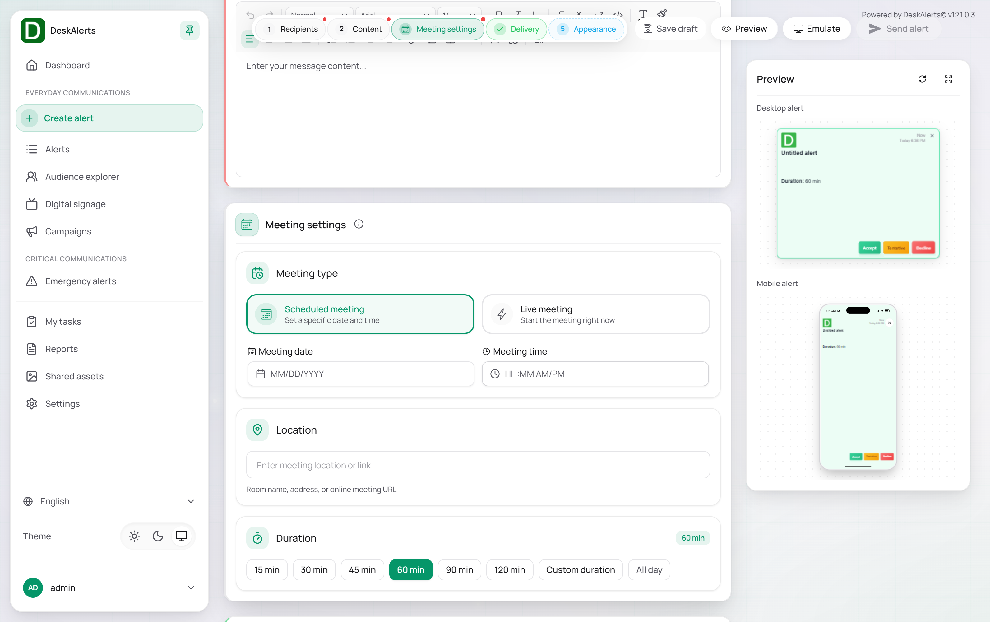
A Meeting alert sends a meeting invitation. The page has Recipients, Content, Meeting settings, Delivery, and Appearance, with a desktop and a mobile preview.
| Setting | Description |
|---|---|
| Meeting type | A scheduled meeting with a date and time, or a live meeting that starts right now |
| Location | A room name, an address, or an online meeting URL |
| Duration | A preset, a custom duration in minutes, or all day |
Important: Calendar invitations are created through the Azure AD application configured under Settings → Alerts → Meeting alert (MS Teams). Without that configuration a Meeting alert cannot be created — the server refuses it with Azure AD settings are not configured. The publisher's email address must exist in that tenant.
RSVP
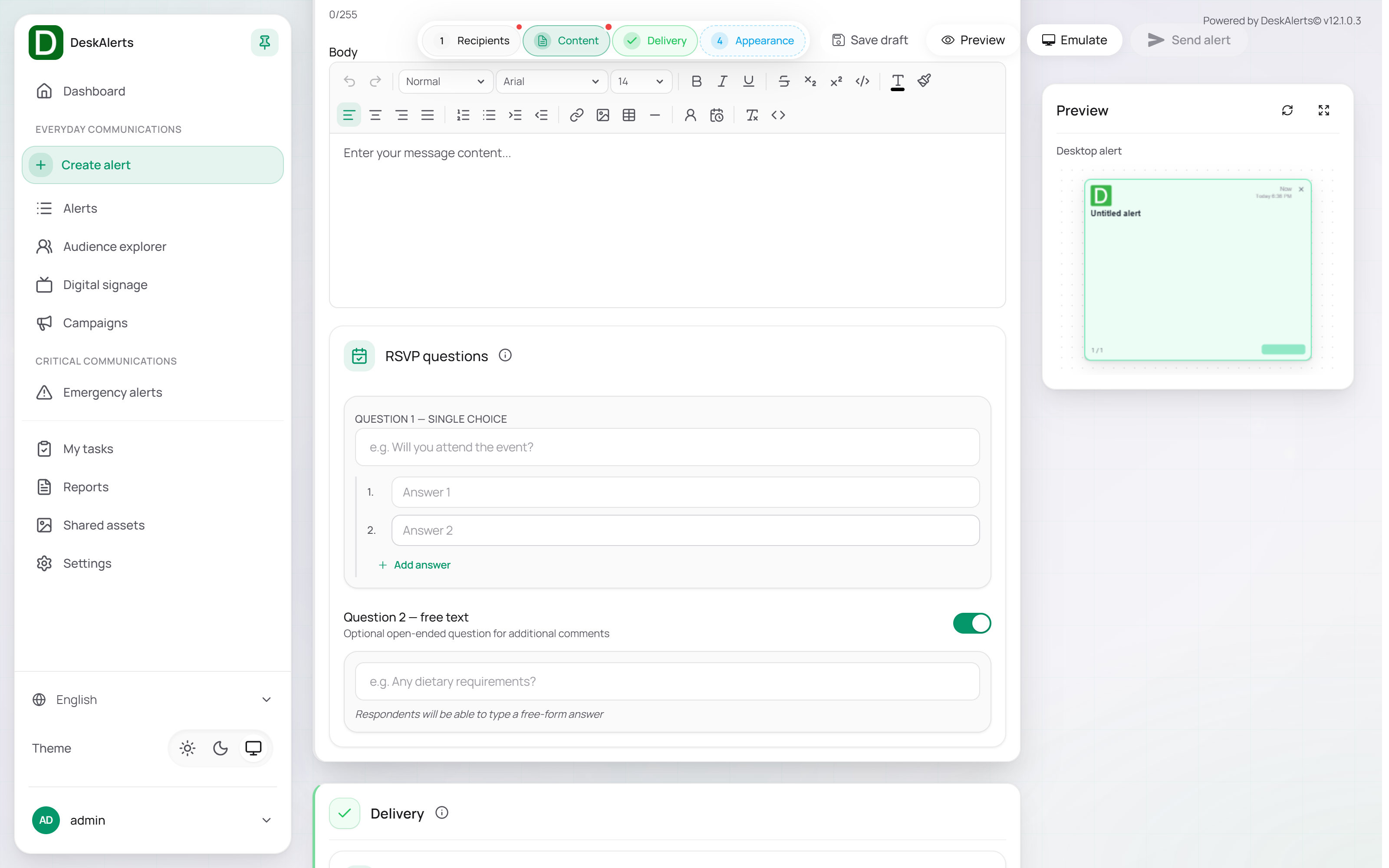
The Content section adds the RSVP question: a single-choice question with two or more answers and an optional free-text question for additional comments. Delivery channels are Desktop and Mobile; there is no Response & tracking section.
Survey / quiz / poll
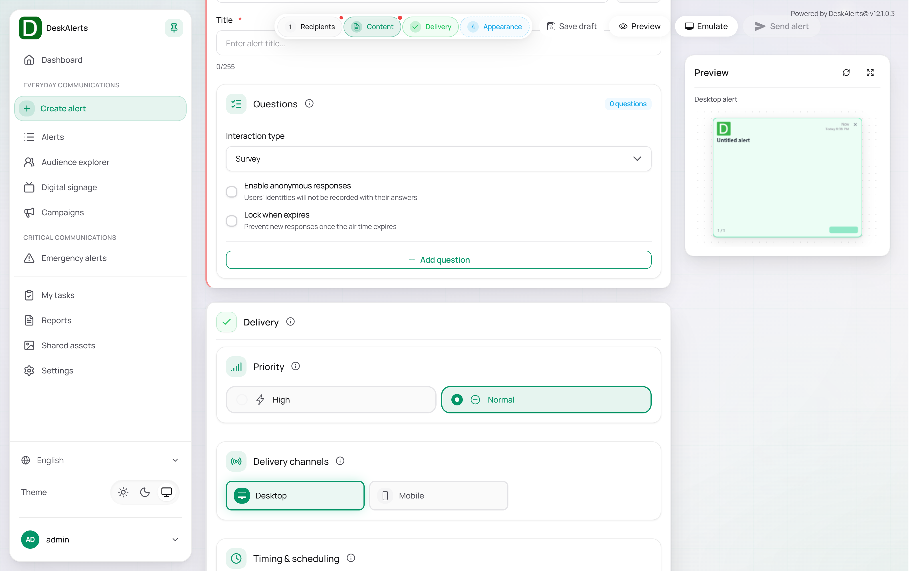
The Content section replaces the message body with Questions (the counter shows how many questions the alert has):
| Setting | Description |
|---|---|
| Interaction type | Survey, Quiz, or Poll |
| Enable anonymous responses | Users' identities will not be recorded with their answers |
| Lock when expires | Prevent new responses once the air time expires |
| Add question | Adds a question with its type, text, and answers |
Delivery channels are Desktop and Mobile. Responses are available on the Reports page.
Microtraining
A short training with an optional quiz: the Content section holds the lesson and the quiz questions; delivery and appearance are as for a popup.
Wallpaper, lock screen, and screensaver
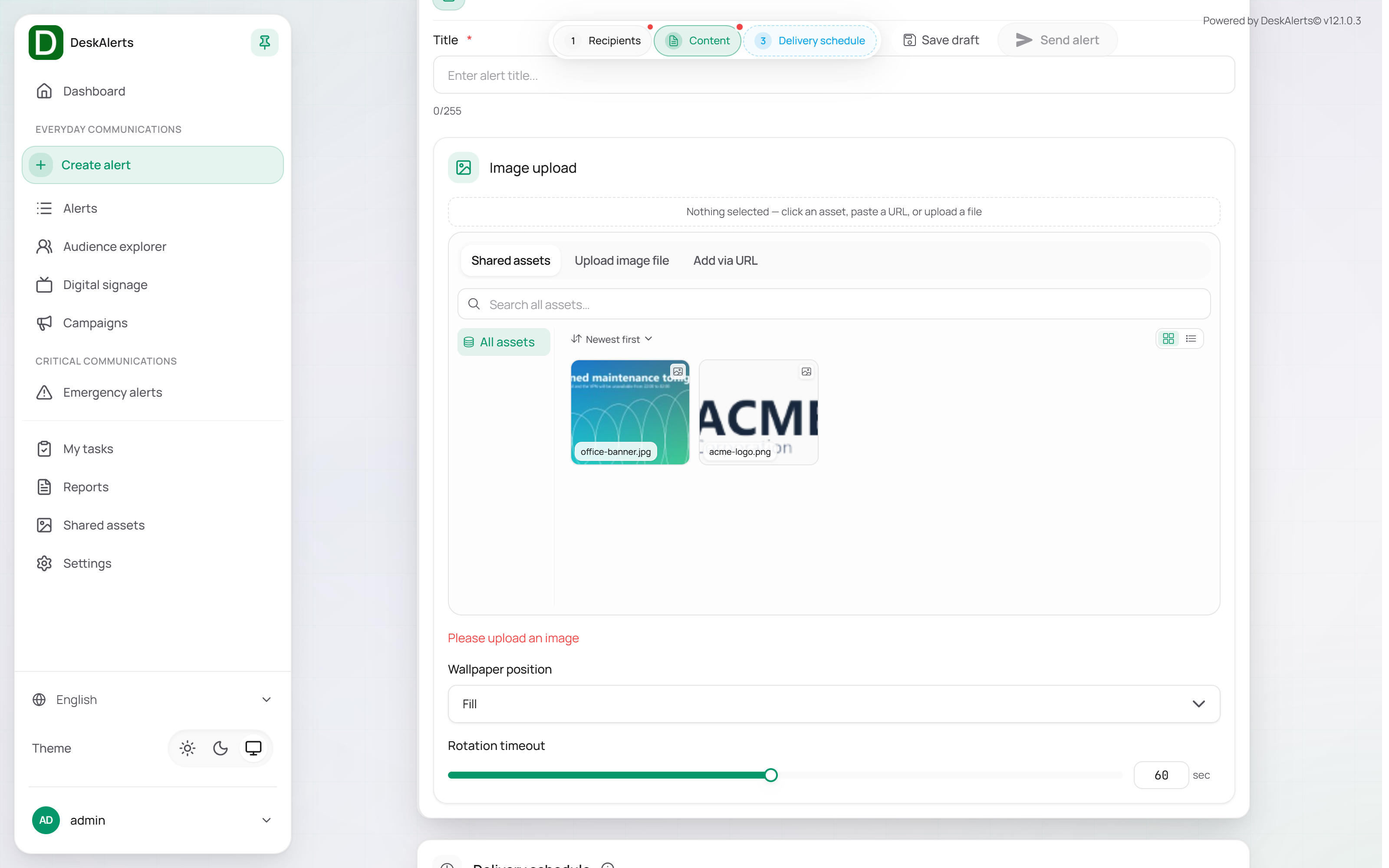
The ambient alerts share a shorter page: Recipients, Content, and the delivery schedule.
| Type | Content section |
|---|---|
| Wallpaper | The title; the image from Shared assets, a file, or a URL; the wallpaper position (for example, Fill) |
| Lock screen | The title; an image or a video URL |
| Screensaver | The title; an image or video from Shared assets, an uploaded or recorded file, or a URL |
The schedule sets when the content starts (immediately or at a date and time) and when it ends (continuously until removed, or until a date and time). Ambient alerts are delivered to the desktop agent only.